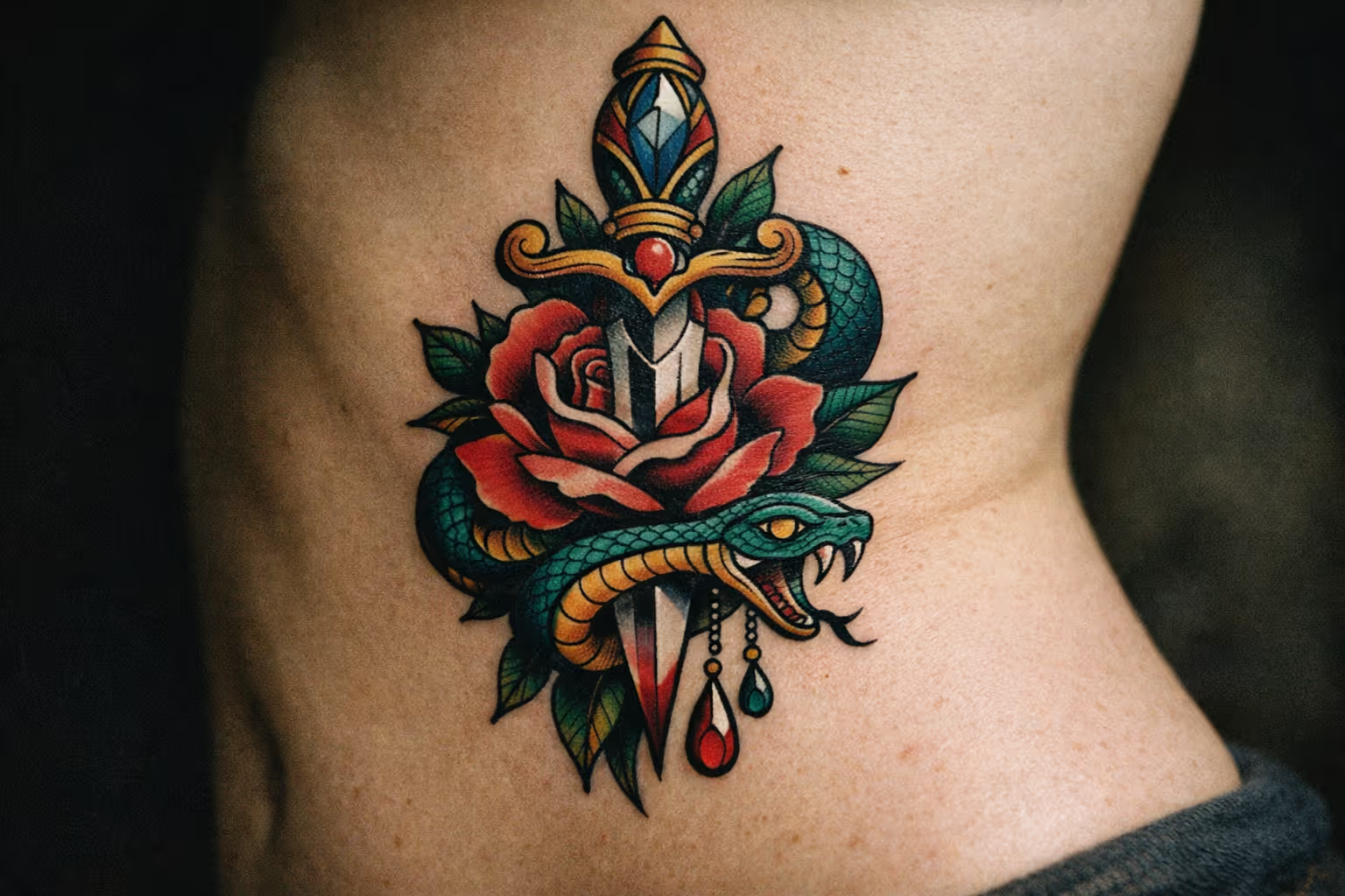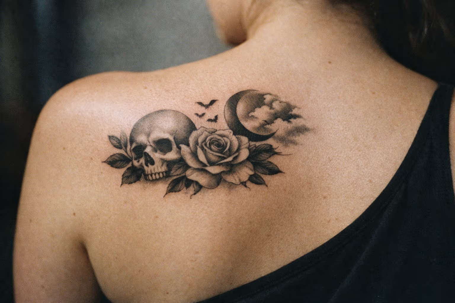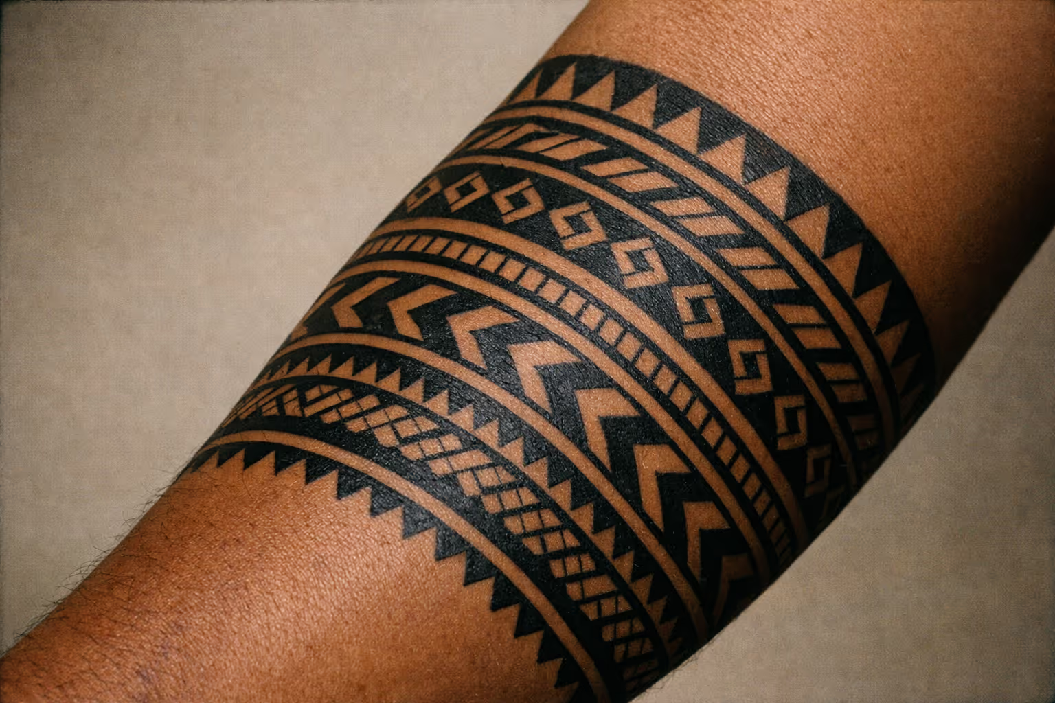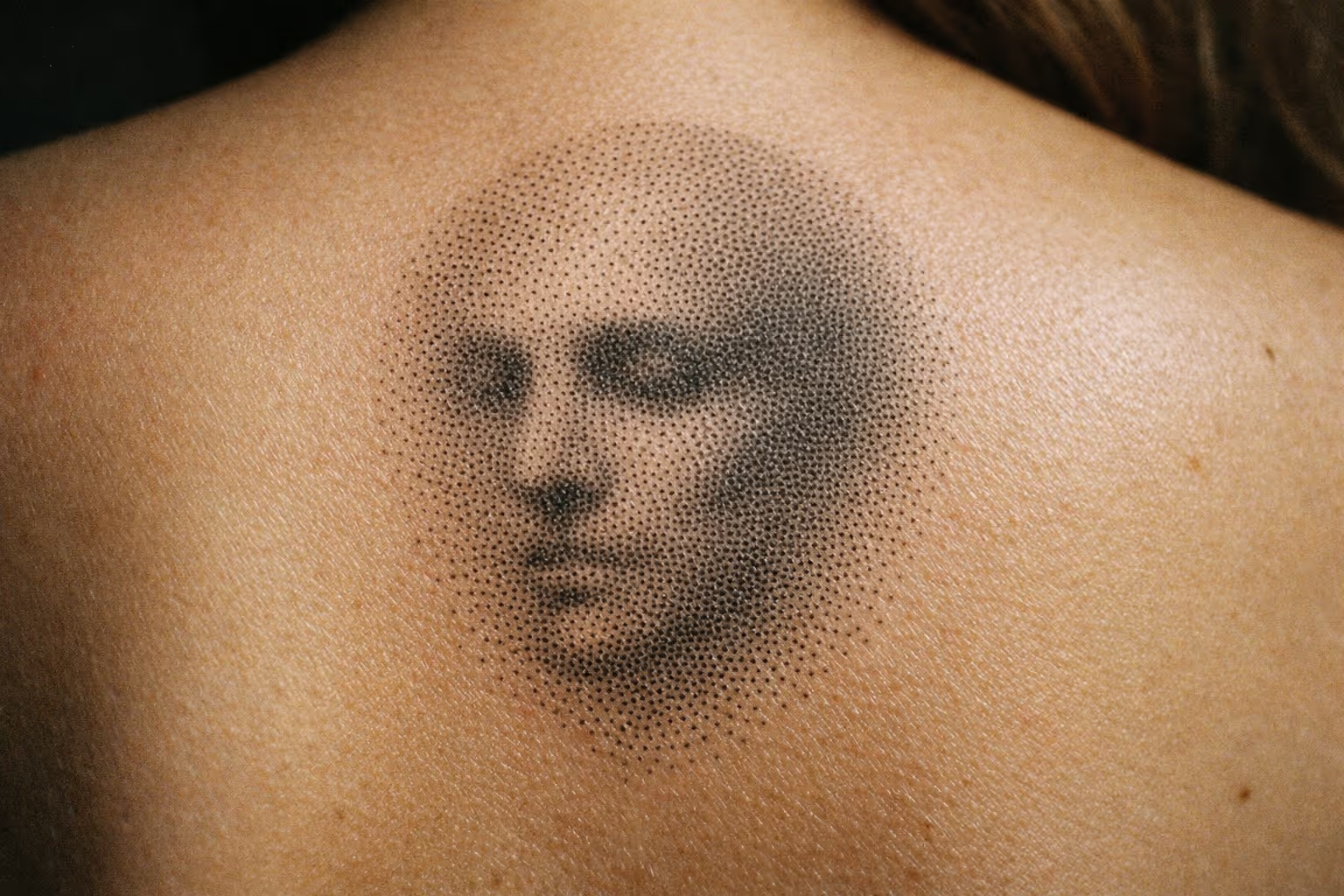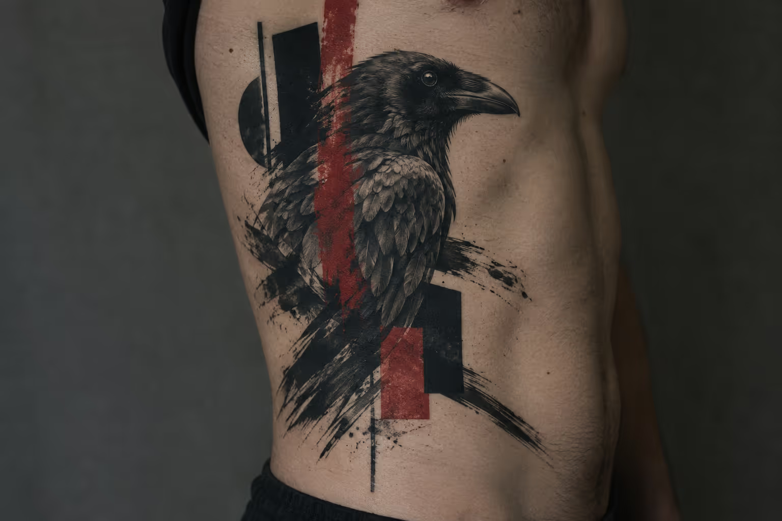
A trash polka tattoo pairs a realistic image (a face, an animal, an object) with graphic disruption: brush strokes, splatters, geometric blocks and typography, traditionally in black and red. Simone Pfaff and Volker Merschky created the style at Buena Vista Tattoo Club in Würzburg, Germany, and first called it “Realistic Trash Polka” (1). Red and black ink alone does not make a piece trash polka. The pairing of rendered realism with collage-like interruption is what defines it, and that pairing shapes every decision after it: artist, subject, size and placement.
What Is a Trash Polka Tattoo? Origins and Style Definition
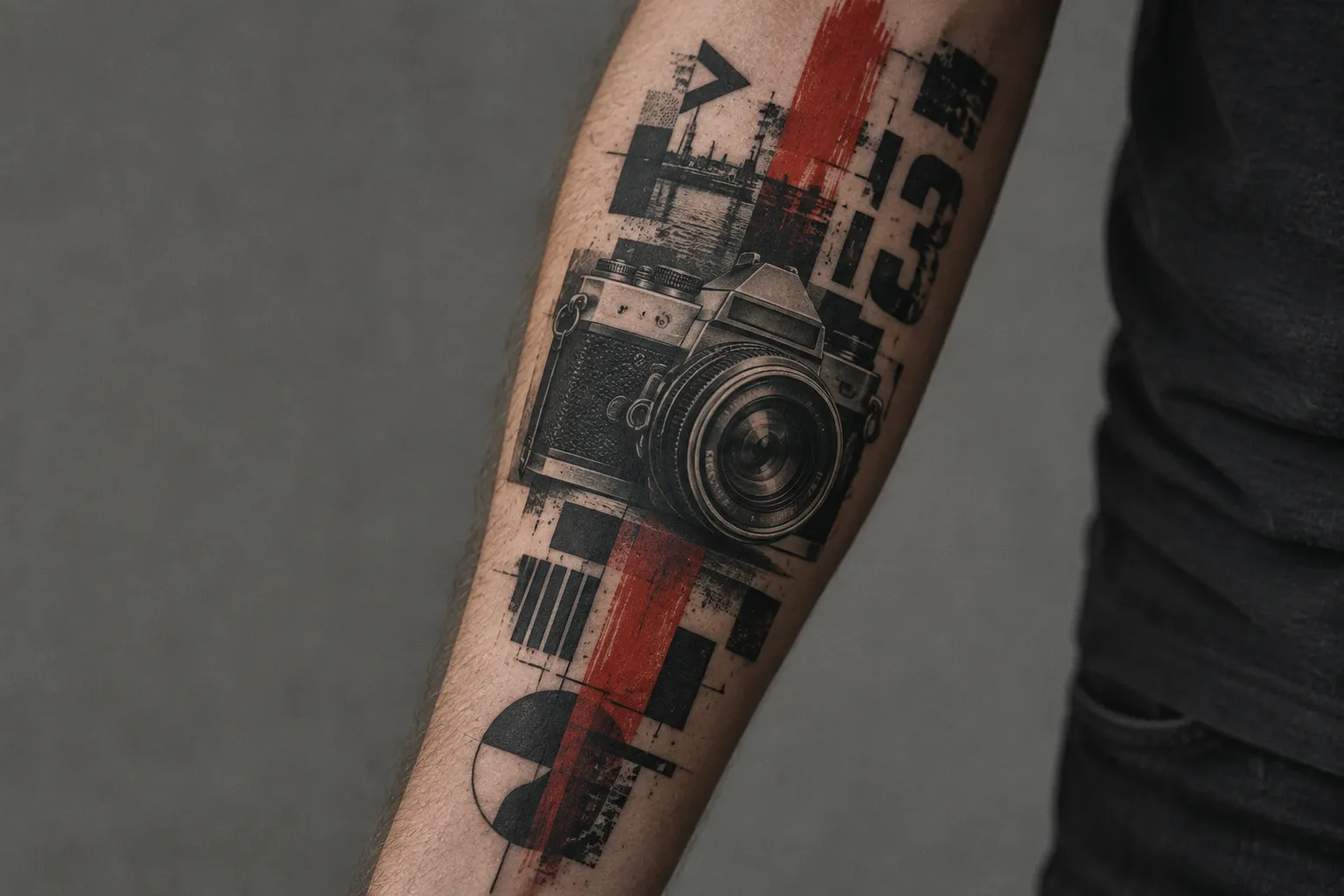
A trash polka tattoo is a mixed-media style that combines realistic imagery with graphic, collage-like elements, traditionally in black and red ink (1). The realistic part can be photorealistic, naturalistic or surreal. The graphic part can include large black areas, brush strokes, geometric or abstract shapes, and lettering in several contrasting fonts (1). The composition reads like a layered image or collage rather than a single illustration dropped onto skin. Typography and graphic marks frame the realistic subject or cut across it (2)(4).
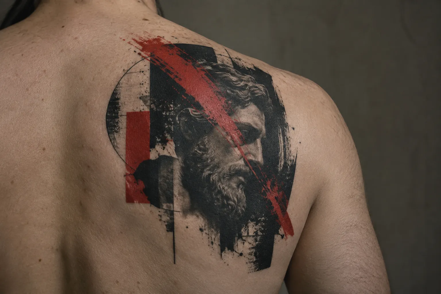
Tattoodo describes the style as having an “Eastern European bent,” built from heavy geometric elements, photo-realistic components and sometimes words, arranged to cover large surfaces of the body (4). Most original trash polka pieces are done at large scale so the motifs and elements have room to work (1). Black and red is the traditional palette, but other colors do appear (1). The style is also known for color contrasts that create an optical effect (1).
If you want a quick test for whether a design qualifies, look for two technical hallmarks:
- A rendered realistic subject with smooth tonal gradation, readable anatomy and convincing depth, interrupted by flat graphic marks that ignore that depth on purpose.
- A limited palette with heavy saturation: packed solid black fields and red used as a structural element (a slash, a block, a stroke), not as a light tint.
The most common pitfall when an artist does trash polka badly is the lookalike. A black-and-gray portrait with a few red splats added at the end, with no composition linking the two layers, is a red-accented realism piece and nothing more. The opposite failure also happens: a strong graphic layout wrapped around a muddy, flat face that cannot hold its own against the black fields around it.
Who created the style: Simone Pfaff and Volker Merschky
Volker Merschky and Simone Pfaff coined the term “Trash Polka” in 1998 at Buena Vista Tattoo Club in Würzburg (1). Tattoodo gives the same pair and the same Bavarian shop, dating the start to the late 90s (4). Two artists, one studio, one city: the origin is well documented.
The name itself is protected. Wikipedia describes “Trash Polka” as a word creation and registered trademark of Merschky and Pfaff (1), and Tattoofilter, which credits him as Volko Merschky, calls the style their creation and registered trademark at Buena Vista Tattoo Club (7). In practice, the founders have influenced many tattoo artists around the world (1), and plenty of them label their own work trash polka. The founders’ work at their Würzburg studio remains the reference point.
Merschky’s own framing is worth reading before you plan a piece. He describes trash polka as “realism and trash; the nature and the abstract; technology and humanity; past, present and future,” a set of opposites pushed “into a creative dance to harmony and rhythm in tune with the body” (7). That last part matters for placement: a design meant to move “in tune with the body” follows its shape, which is one reason the style suits large, flowing areas like the back, thigh and full arm.
Why it was originally called “Realistic Trash Polka”
The original name described the recipe. “Realistic” refers to the realistic images, and “trash” refers to the graphic layers, lettering and abstract elements that disrupt them (1)(4). The founders later dropped “Realistic” because they did not want to set rules for their style (1)(4). The side effect is that the word carrying the most technical weight, “realistic,” is the one that disappeared, which makes it easier to mistake any red-and-black design for trash polka.
“Polka” was chosen in a musical sense: everything combined together like a composition (1), or, as Tattoodo puts it, everything coming together like a musical composition (4). Merschky’s language about rhythm and a “creative dance” between opposites points the same way (7). Read the word as a description of how the elements should move together across the skin, not as a reference to the dance itself.
Here are the trade-offs in one place. On the plus side, the realism-plus-graphic contrast reads from across a room. The meaning is flexible because you choose the anchor subject, and the style holds up well at large scale, where the collage has space. On the downside, you need an artist strong in two different skill sets. Dense layering turns into visual noise if the focal image is not clear. Red ink often needs a touch-up sooner than solid black. And if you want a small, minimalist look, this style works against you.
✓ Pros
- The collage structure lets the focal subject carry the personal meaning while the surrounding marks control visual movement.
- A large composition can be mapped to follow body contours instead of forcing a centered, self-contained image.
✗ Cons
- A design that relies on tiny distressed lettering or tight clusters of splatter can lose legibility as the ink settles.
- Planning a sleeve as a unified composition limits how easily later additions can be treated as separate, unrelated pieces.
The Red-and-Black Palette and the Graphic Layers That Define the Look
The trash polka style uses black and red as its signature palette, layering splatters, geometric shapes and typography over a realistic subject (2)(5). A plain red and black tattoo is not automatically trash polka. An American traditional rose with red petals and black outlines uses the same two inks and belongs to a different style entirely. What separates them is structure: in trash polka, the red and the black do different jobs.
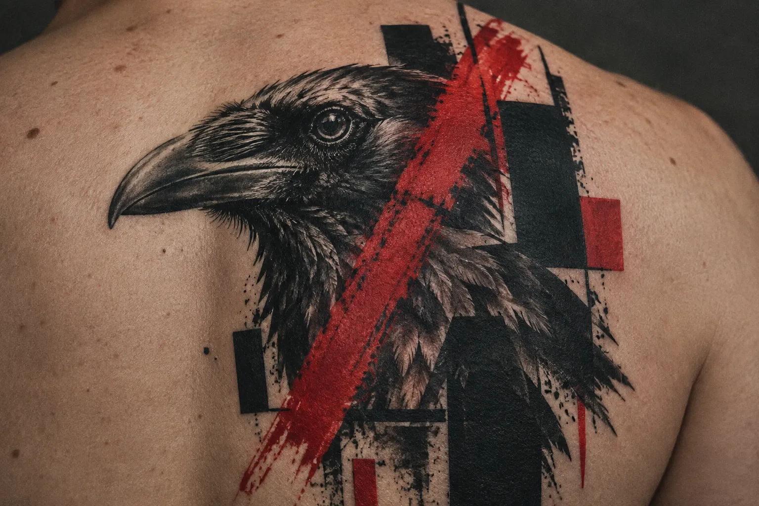
Black does two things. It renders the realistic subject in black and gray shading, and it also appears as flat, fully packed fields: bars, circles, blocks, heavy brush marks. Dark Crow Tattoo describes the combination as “high-saturation black mixed with aggressive red accents” (5). The red rarely shades anything realistic. It slashes, frames, underlines or splashes, and it usually sits on its own plane, as if painted over a photograph.
From the chair, saturation is the thing to watch. Those flat black areas need to heal solid, with no patchiness, because any gaps will show against the smooth gradient of the realistic face beside them. Red is harder to pack evenly than black, and it heals lighter on many skin tones. Expect your artist to go over red areas more than once, and budget for a possible touch-up session after healing.
Typography and lettering as a graphic layer
Lettering is one of the graphic layers regularly combined with the realistic image (2)(4). When words are included, Tattoodo notes they are generally set in a typewriter font, for the effect of a collage or ransom note (4). Stencil, hand-scrawled or bleeding letters appear too, often cropped, overlapped or partly buried under a black field. Full legibility is not always the goal, but minimum letter sizes still apply. Ink spreads under the skin over the years, and letters below the floor turn into smudges well before the rest of the piece ages.
Size lettering by letter height (the height of the whole letter), with the same floors as our tattoo font guide:
- Block, stencil, typewriter and serif letters: at least 6 mm (1/4 in).
- Standard script: at least 12 mm (1/2 in).
- Fine, ornate or brushy script: at least 25 mm (1 in).
On the wrist, only bold script or block lettering holds. Trash polka lettering in general works better on flat, stable skin such as the outer forearm, the upper back or the outer thigh than on areas that twist and crease.
Splatter, geometry, and abstract marks
The abstract layer includes brush strokes, smudges, splatters and grunge textures (5), as well as large black areas and geometric or abstract shapes (1). Circles, bars, triangles, grids, arrows and hard-edged rectangles are common. They give the eye a flat, graphic counterweight to the rounded realism.
Splatter is the element that ages worst. A spray of tiny red dots looks crisp when fresh, but fine dots sitting close together tend to merge as the ink settles. Ask your artist for fewer, chunkier splatter marks with real skin showing between them. The same applies to thin geometric lines: in a trash polka piece, a fine line placed next to a packed black field will look thinner every year. Bold geometry that matches the weight of the black fields holds up much better.
Choosing an Artist: Why Realism and Graphic Skill Must Both Be Strong
The deciding factor when choosing a trash polka artist is proof of strength in both realism and graphic composition, not overall skill level, because abstract designs and realistic motifs are both key elements of the style (1). Dark Crow Tattoo, a Copenhagen studio that works in it, calls trash polka “not beginner-friendly” and says it takes deep tattoo experience, design thinking and style sensitivity (5). A brilliant realism artist with weak graphic instincts will produce a portrait with decorations. A brilliant graphic artist with shaky realism will produce a strong layout around a face that looks flat or off. Either way, the core of the style is missing.
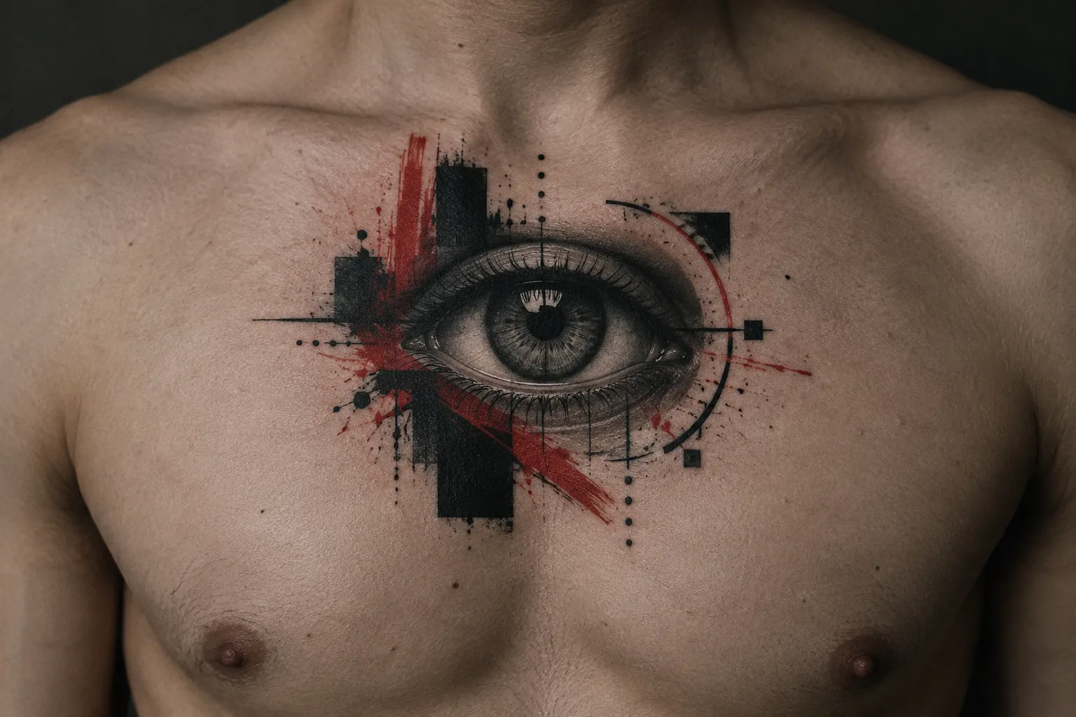
This is why a general “best tattoo artist near me” search does not help much here. Many excellent realism specialists do not do trash polka, and many blackwork and graphic artists avoid realistic rendering. You are looking for someone whose portfolio shows both skills in the same pieces, not in separate folders.
What a balanced portfolio looks like
Go through the portfolio with two separate checklists, then look for pieces where both are met at once.
For the realism half:
- Eyes and faces that stay convincing at arm’s length, with a clear light source and smooth transitions from highlight to shadow.
- Contrast in the black and gray: true darks next to clean skin-tone highlights, not everything sitting in the mid-grays.
- Healed photos, not only fresh ones. Realism looks sharpest on day one, and healed shots show whether the gradients survived.
For the graphic half:
- Confident brush marks that look like single decisive strokes, not something patched together.
- Deliberate negative space, where the gaps between elements look planned.
- Lettering spacing that stays even even when the letters are distressed or cropped.
The red flag is a portfolio that clearly nails only one half. Look for realism pieces where the red was obviously added afterward and does not interact with the subject, or graphic pieces where the realistic element is small, simplified or avoided altogether. If an artist’s trash polka tagged work mostly lacks a realistic anchor, you are looking at graphic blackwork with red accents.
Bringing references that separate subject from texture
Glam’s guide suggests starting by selecting a central image, then gathering inspiration for the abstract brushstrokes and geometric designs that will accompany it (2). Add your lettering as a third group, and keep the three apart:
- Subject: the face, animal or object you want rendered realistically, ideally as a high-resolution photo with strong lighting.
- Texture: brush strokes, splatter patterns, geometric layouts, collage posters or other trash polka pieces whose graphic layer you like.
- Lettering: a font sample, a handwriting scan or a photo of a sign, plus the exact words.
Then ask the artist to compose the three as one design rather than assemble unrelated motifs: Tattoodo describes the style as bringing seemingly opposite elements together into a united final image (4). Separating the references makes the conversation about contrast much easier. You can say “this face, that texture, these words” and let the artist decide how they collide. Three examples per group is plenty. Twenty references for one forearm piece usually produces a crowded design.
Trash Polka Design Ideas: Portraits, Animals, and Objects
Trash polka tattoo ideas start from one realistic anchor subject, and a portrait, animal or object is equally valid within the style (2)(6). No subject is more “correct” than another. Pick the anchor that means something specific to you, then build the red-and-black collage around it.
Portrait-led designs
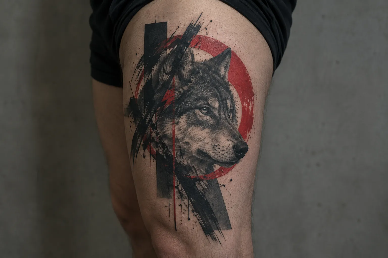
A portrait-led approach makes a face the main realistic anchor, with red-and-black marks and typography as supporting layers (2). Classic moves include a red bar across the eyes, a black brush stroke erasing half the face, a geometric frame cutting through the jaw, or typed words running along the neckline. The face carries the emotional weight, and the graphic layer adds tension.
Portraits need room. A realistic face shrunk too far loses detail in the eyes first, and the surrounding collage needs space beyond the face. The outer thigh, upper arm or shoulder blade give it that room: Dark Crow Tattoo describes upper arms and shoulders as ideal for vertical stacking of portraits with graphic overlays, and thighs as suited to long, bold layouts (5). The outer thigh and upper arm are among the milder placements for pain. The spine and ribs sit higher on the scale: ribcage > outer thigh > upper arm.
Animal- and object-led designs
Animal- and object-led designs use the same collage structure around a different subject (2)(6). Bodyartifact’s examples include a crowned skull with red splashes and a bird piece (6). Ravens, wolves, stags, clocks, anatomical hearts, cameras and old radios are all regulars. An object can be the more personal choice: your grandfather’s pocket watch or the camera you learned on means more than a stock image of a lion.
Animals are slightly more forgiving at smaller sizes than faces, because slight distortion in a bird’s eye is less noticeable than in a human one. The outer forearm works well for a single animal or object with a red stroke and a line of text. The outer forearm is one of the easier spots to sit for: forearm < inner bicep < ribcage.
Graphic-forward designs with a realistic anchor
For a more graphic direction, you can make geometry, text and abstract marks prominent while keeping a recognizable realistic element, which preserves the defining contrast: abstract designs and realistic motifs are both key elements of the style (1). Picture a large composition of red blocks, black bars and overlapping typography, with one realistic eye, hand or rose sitting inside it. The realistic element can be small relative to the whole, but it has to be there and it has to be rendered well.
Graphic-forward work suits long vertical placements such as the side ribcage, the full outer arm or the spine, where you can run a long column of shapes and text. Be honest with yourself about pain: ribcage and spine are harder sits than the forearm or thigh, and heavy black fill on the ribs takes stamina. Keep the realistic anchor at least palm-sized so it does not get lost.
What a Trash Polka Design Means, and Why It Varies
Trash polka tattoo meaning is design-specific: the style has no shared symbol dictionary, and any meaning comes from the subject and marks chosen for that piece, which is why the meaning varies from one design to another (6). Tattoodo goes further: the style’s “dissociative imagery” is meant to weaken the apparent meaning behind the images (4). A tattoo guide that assigns trash polka one fixed meaning, such as “chaos,” “rebellion” or “grief,” is inventing a code the style does not have.
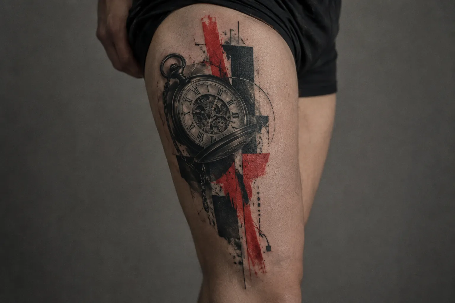
What the style does carry is a built-in artistic contrast. Realism against disruption, the orderly against the chaotic, the photographic against the painted. Merschky’s list of opposites (realism and trash, nature and abstraction, technology and humanity, past, present and future) describes the effect the founders are after (7). It is an approach to composition. It does not say what your particular tattoo means.
The cultural origin is German, from a Würzburg studio in 1998 (1). The style has no roots in a longer symbolic tradition the way irezumi or Polynesian tattooing does, so there is no older meaning system to borrow from. Popular coverage does attach moods to the look: one artist interviewed by Glam credits its popularity to its “rebellious and avant-garde nature” (2), and Tattoodo says it is meant to evoke brutality, passion and aggressiveness (4). Those describe the style’s effect, not a symbol your particular tattoo carries.
Meaning lives in your choices. A raven, a clock or a rose each carries meanings from their own traditions, and those travel with the image into the collage. Words you choose for the lettering layer say exactly what you want them to say. Even the placement of the red can carry intent: a red slash across a portrait of someone you lost reads differently from a red frame around them. If you want your tattoo to mean something specific, build it into the subject, the text and the composition, and explain that intent to your artist at the consult.
Trash Polka Sleeves and Other Large-Scale Placements
A trash polka sleeve works best as one unified layered arrangement. Tattoodo recommends an arm or leg sleeve, or a dedicated part of the torso, because the style’s small details, such as typewriter lettering, need a large canvas (4). There is no standard size, session count or design sequence for one: anyone quoting you a fixed number of sessions before seeing your arm and your design is guessing. Scale and pacing get worked out individually with your artist, as for any sleeve tattoo.
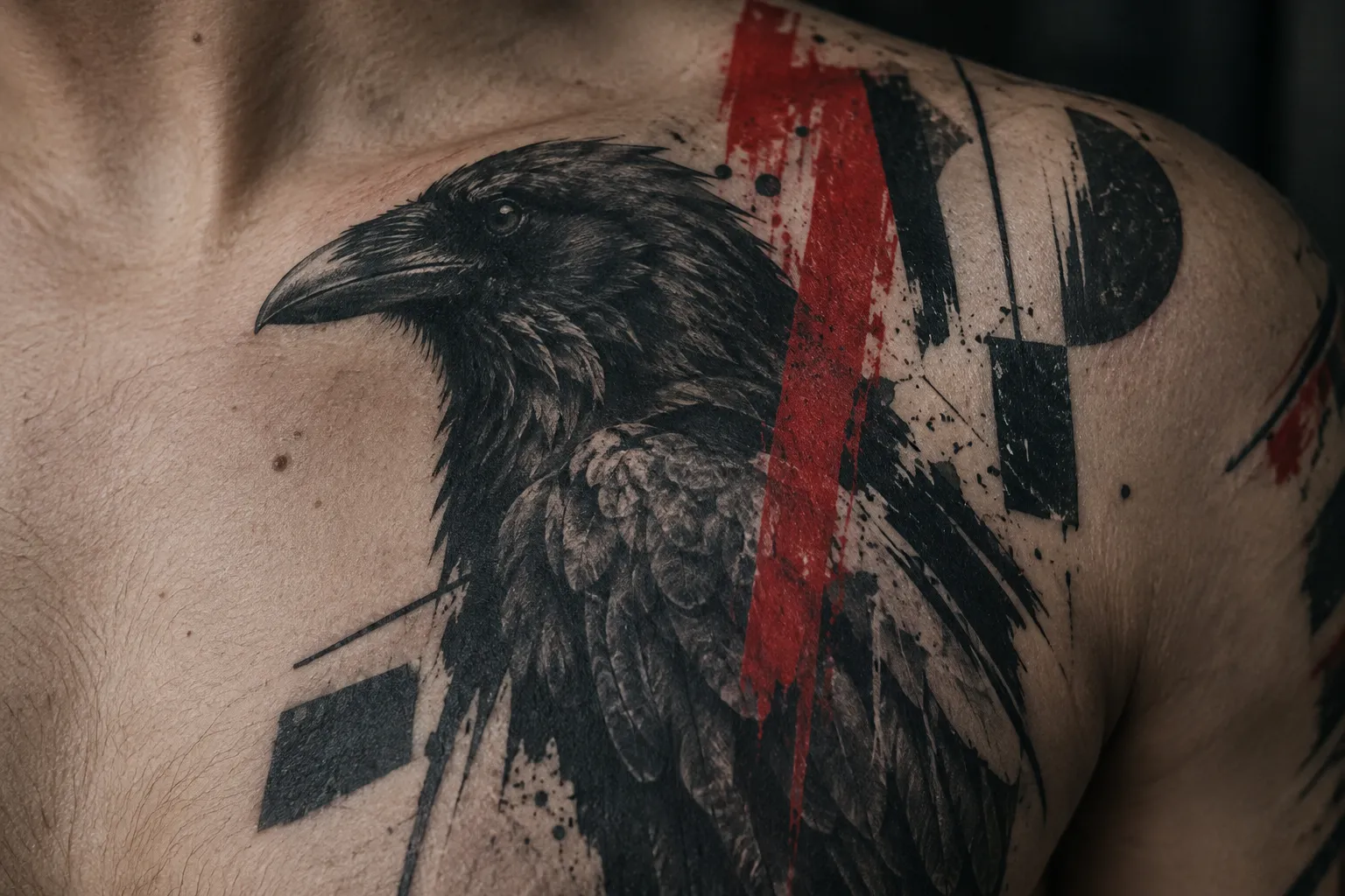
Large scale is the style’s natural setting. Most original trash polka pieces are done big so the motifs and elements have room (1), and Tattoodo notes that the designs are built to cover large surfaces of the body (4). A full sleeve, a half sleeve from shoulder to elbow, a back piece or a full thigh gives the collage space to breathe, which helps with how the piece reads and how it ages.
Planning a sleeve as one composition, not separate pieces
Discuss placement and scale while planning the composition, since the style’s layered elements need to read as one arrangement over a large area (4). In practice, that means the whole sleeve is drawn, or at least mapped, before the first line goes in. The red strokes should travel. A slash that starts on the shoulder and wraps around the elbow ties sections together in a way separate tattoos cannot.
A few placement rules from the chair:
- Put the realistic anchor on the flattest, most visible surface: the outer upper arm or outer forearm. Faces distort when they wrap around a narrow limb.
- Keep lettering away from the elbow ditch and the inner elbow crease. Skin there folds and stretches, and text warps. Letters also need to meet the height floors above: block at least 6 mm (1/4 in), standard script at least 12 mm (1/2 in).
- Use the hard-to-read zones for texture. The elbow, inner arm and armpit edge are good places for splatter and black fields, where precise detail would be wasted.
Pain varies across one arm: elbow ditch and inner bicep > outer upper arm > outer forearm. Many artists start a sleeve on the outer arm and work toward the tender areas once you know how you sit.
The 1/3 rule and why sleeve segments matter
The “1/3 rule” in tattooing is a loose composition guideline, not a formal standard, and artists use the term for slightly different ideas. One version splits an arm into three zones (upper arm, elbow, forearm) and treats each as its own panel that still has to connect to the others. A second version borrows the photographer’s rule of thirds and places the focal point about a third of the way into the area instead of dead center. A third version is about balance: leave roughly a third of the area as breathing room, whether that is bare skin or a quieter texture.
None of these is specific to trash polka, and none comes from the founders. They still help with trash polka sleeve planning. Give each third a job: one holds the main realistic anchor, one carries a secondary subject or the lettering, and one is mostly graphic. Then let the red and the black fields cross the boundaries so the thirds read as one piece. A sleeve with three competing portraits and no graphic zone usually fails the focal-point test that dense trash polka work depends on.
Safety Questions to Ask and How to Protect the Ink Afterward
Before you book a trash polka tattoo, ask which ink brands the studio uses and how it sterilizes equipment, because the FDA links tattoo infections to contaminated inks and unhygienic practices (9). The FDA has received reports of infections from contaminated tattoo inks and of allergic reactions to the inks themselves (9). A large red-and-black piece puts a lot of pigment into your skin over several sessions, so these questions matter more for a sleeve, not less.
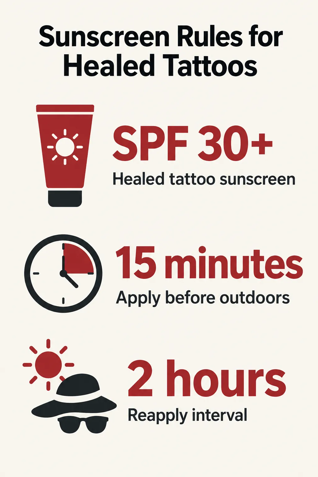 The AAD advises using SPF 30+ sunscreen on healed tattoos, applying it 15 minutes before going outdoors, and reapplying at least every 2 hours.
What to ask the studio about ink and sterilization
The FDA notes that even unopened, sealed tattoo inks can harbor bacteria and other microorganisms that cause infections (9). You cannot inspect ink yourself, but you can ask direct questions:
- Which ink brands and which specific colors will you use? Write down the answer and keep it. If a reaction occurs, the FDA advises asking for the ink’s brand, color and any lot or batch number, to help determine the source of the problem and how to treat it (9).
- Are needles single-use and opened in front of me?
- How are reusable parts sterilized, and do you use an autoclave?
- Is ink poured into single-use caps for each client?
A good studio answers these without getting defensive. Also tell your artist about any medications you take, especially blood thinners, and ask your doctor before changing a prescribed medication for a session. Extra bleeding makes ink harder to pack, which is a real problem when the flat black fields need to heal solid.
The sunscreen routine that keeps red and black from fading
Sunscreen is for healed skin. Before that, follow the healing timeline from our tattoo aftercare guide and keep the tattoo covered:
- Day 1-3: keep the wrap on for as long as your artist says, then wash gently with lukewarm water and a mild, fragrance-free soap, and pat dry. Expect some redness, weeping and tenderness, especially around heavily packed black areas.
- Day 4-7: the skin tightens and starts to flake. Apply a thin layer of fragrance-free moisturizer two or three times a day. Do not soak the tattoo in a bath, pool or the sea. Cover it with sun-protective clothing instead of putting sunscreen on open skin.
- Week 2: peeling and itching peak. Do not pick at the flakes, since that can pull out pigment, and red areas tend to show those gaps.
- Week 3-4: the surface usually looks healed, but the deeper skin is still settling, with full integration around week 6. Keep the tattoo out of direct sun for the first 4-6 weeks.
Once the tattoo is healed, the AAD’s routine is specific: use a broad-spectrum, water-resistant sunscreen with SPF 30+, apply it 15 minutes before going outdoors, and reapply at least every 2 hours (10). UV light can fade some tattoo inks, and the AAD also advises staying away from tanning beds and sunlamps, which can fade tattoo ink and raise skin cancer risk (10). Tattoodo adds that because trash polka does not rely on bold black outlines, the style needs even more care against the sun to prevent blurring or fading (4).
When healing looks wrong
Redness and swelling in the first few days are normal, but normal redness does not rule out a complication. The FDA advises contacting the tattooist and a health care professional if the area seems not to be healing or a rash develops, especially if you also develop a fever (9). It adds that more aggressive infections can cause high fever, shaking, chills and sweats, and that a rash may also signal an allergic reaction to the ink (9). If you do see a professional, bring the ink brand, color and batch details from your studio: that is the information the FDA asks for to trace a reaction (9).
Frequently Asked Questions
- What does a Trash Polka tattoo mean?
- Trash Polka has no fixed symbolic meaning; the subject, chosen words and composition create the meaning of an individual tattoo.
- How much does a Trash Polka tattoo cost?
- In February 2024, tattoo artist Syd Smith told Glam that trash polka tattoos in the United States cost at least a few hundred dollars, rising with size and customization; ask your artist for a quote on your specific design.
- What is the 1/3 rule for a tattoo sleeve?
- The 1/3 rule is an informal composition aid, not a required tattoo standard; ask your artist which version they mean before using it to plan a sleeve.
- Do Trash Polka tattoos age well?
- Trash Polka tattoos age best when their marks have room to remain distinct; designs built around tiny dots, fine lines or small lettering lose clarity sooner.
- What colors and motifs are used in Trash Polka tattoos?
- Traditional Trash Polka pairs black and red with a realistic anchor and graphic marks; other colors can appear, but red and black alone do not define the style.
- Is Trash Polka a trademark?
- Yes. Wikipedia and Tattoofilter both describe the name Trash Polka as a registered trademark of its founders, Volker Merschky and Simone Pfaff; many other artists still work in the style.
- What should I consider before getting a Trash Polka tattoo?
- Check that the artist can show healed examples combining convincing realism with deliberate graphic composition, then discuss how the design will fit your chosen body area.
- How do I protect a Trash Polka tattoo from fading?
- After the skin has healed, use broad-spectrum, water-resistant SPF 30+ sunscreen before outdoor exposure and reapply every two hours; keep fresh tattoos covered instead.
Before You Book: Artist First, Then Size and Sun
Trash polka is defined by realism colliding with graphic disruption. Red and black ink is the usual vehicle, not the definition. That means the most important decision is the artist: find someone whose healed work proves they can render a convincing face or animal and also throw down a confident brush stroke and clean lettering in the same piece. The second decision comes after healing. An SPF 30+ routine, applied 15 minutes before going out and renewed at least every 2 hours, is the AAD’s defense against UV fading (10).
Meaning is yours to build into the subject and the text, so do that work before the consult. Gather your three reference groups (subject, texture, lettering), pick a placement with enough flat space, such as the outer forearm, upper arm, thigh or back, and book a composition consult before you commit to a size. For a sleeve, get the whole arm mapped first, and expect the number of sessions to be worked out with your artist rather than fixed in advance.