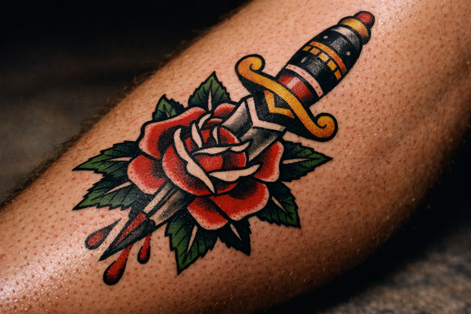
A fine-line cursive quote that reads beautifully on a screen at year zero can turn into an unreadable smear by year three. I’ve seen it happen more times than I can count, and the failure almost always traces back to one decision: the tattoo font. Not the placement. Not the artist. The font. Choose the wrong one and it ages badly no matter who tattoos it or where it sits. The four main font families each age differently, each has a minimum size below which it stops working, and generators can preview them all before you commit. Here’s what I’d tell you across the chair before you sign anything.
Lettering tattoos carry a real trade-off, and it’s worth being honest about it before you dive into style specifics.
✓ Pros
- Highly personal: names, dates, and quotes mean something specific to you.
- Bold and block styles age predictably well for decades.
- The style range runs from minimalist single words to dramatic blackletter.
- Generators let you preview dozens of styles before committing.
- Short text pieces often finish in a single session.
✗ Cons
- Fine-line and ornate scripts are among the most-regretted categories.
- Ink spread causes thin strokes to blur and merge over years.
- Minimum size requirements are stricter than most people expect.
- Digital previews don't simulate how a font ages on skin.
- Long quotes in decorative fonts become unreadable at small sizes.
The Four Main Tattoo Font Families, Explained
Tattoo lettering fonts fall into four practical families: cursive/script, blackletter/gothic, bold/block (serif and sans-serif), and fine-line/minimalist, and the best tattoo fonts for you depend entirely on which family matches your text and placement. Most generators sort their styles into these same categories, so learning the map here makes every tool downstream easier to use.
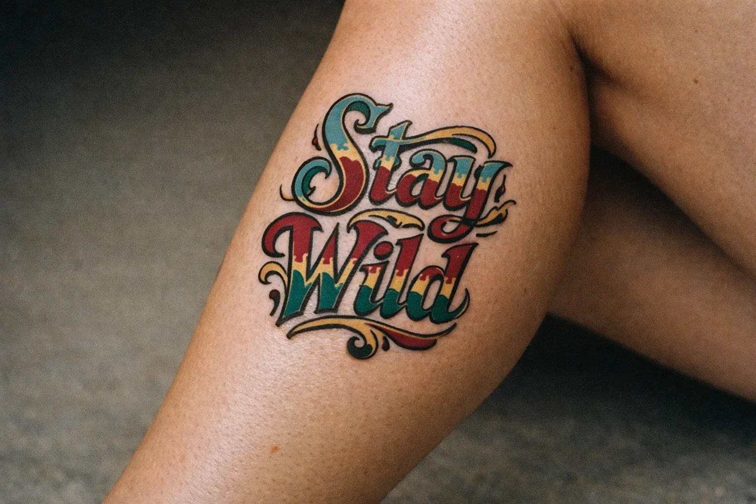
The single most important thing to understand upfront is the aging profile. Thick strokes hold contrast as ink spreads over years; thin strokes placed close together blur and merge. That one physical fact drives every recommendation in this guide. I keep coming back to it because clients keep underestimating it: a font that looks sharp at two weeks can look muddy at three years if the strokes were too thin to begin with. Custom hand-lettered scripts from a good artist sit outside the standard families; they’re drawn specifically for your body area and size, which is why they often age better than any stock font at the same dimensions.
Cursive and script
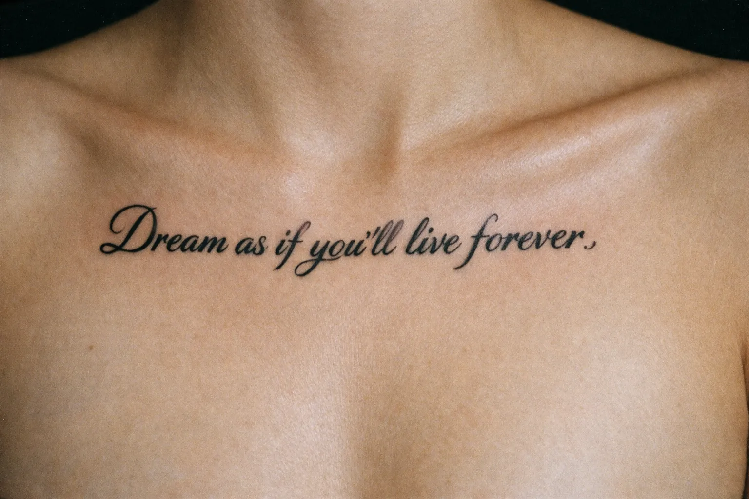
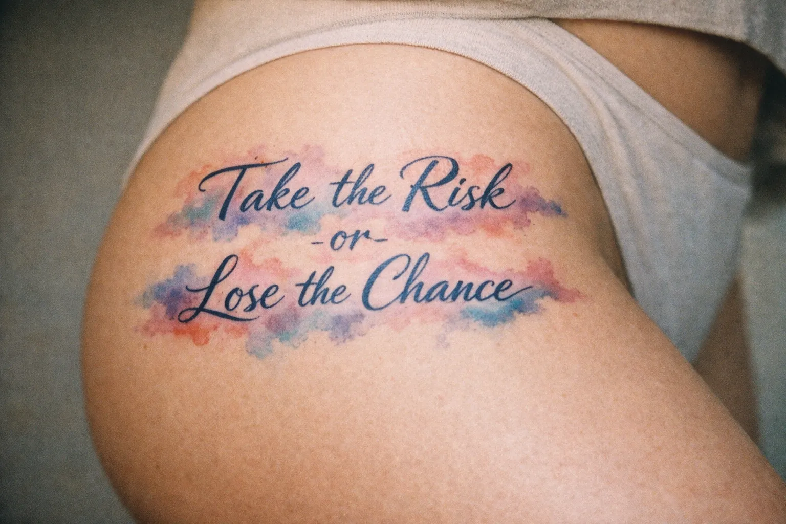
Cursive and script fonts use flowing, connected letterforms and are the most-requested family for names, single words, and short quotes. You’ll see them on the forearm, wrist, collarbone, and ribs. Subtypes range from fine script (delicate, airy) through bold script and italic script to full calligraphy and Chicano script. The two technical hallmarks of the family: variable stroke width (thick downstrokes, thin upstrokes) and fully connected letterforms where each character flows into the next. The connected strokes are exactly what makes them risky at small sizes: the gaps between letters are where ink spread does its damage.
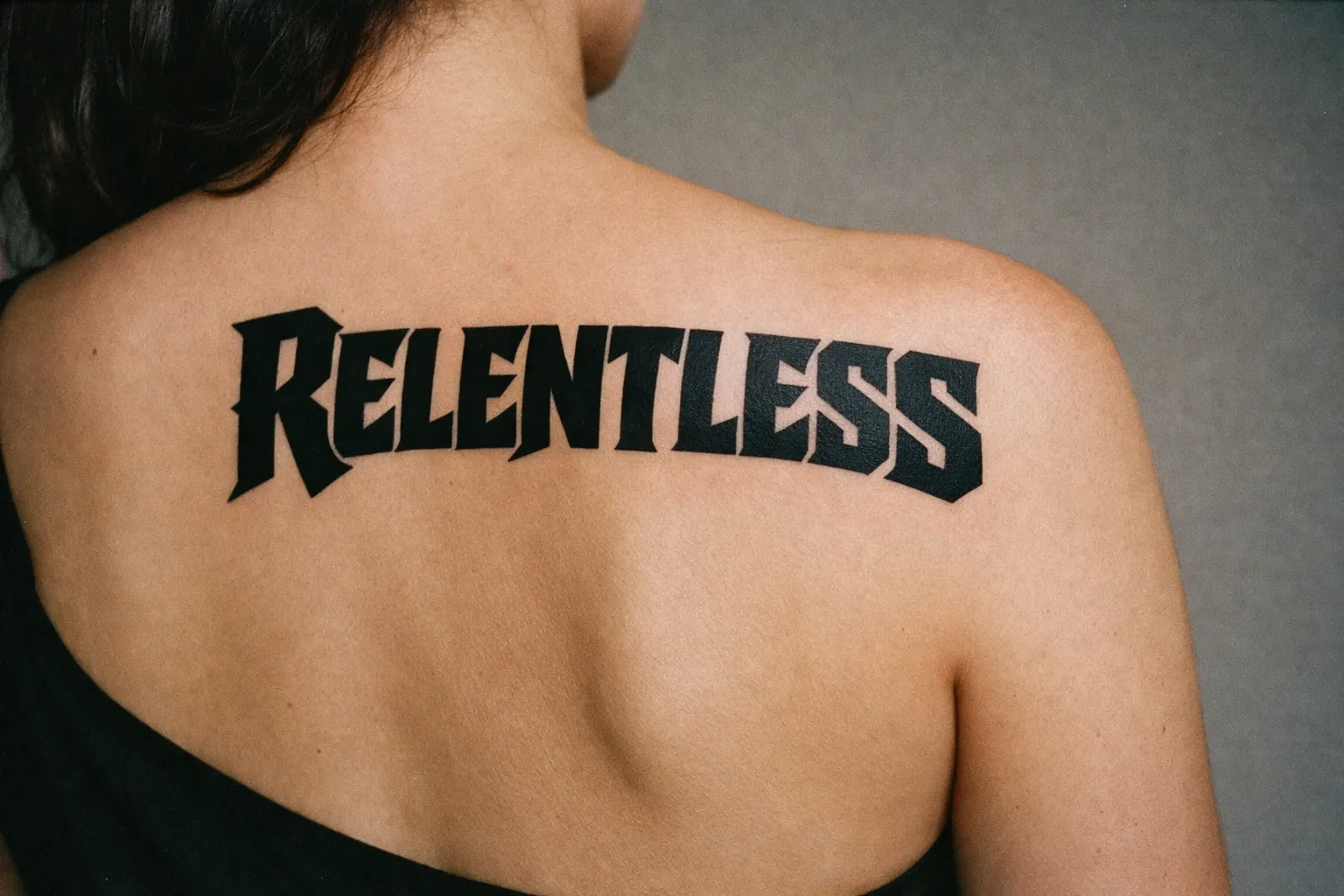
Blackletter and gothic (Old English)
Blackletter originated in medieval Western Europe, specifically the manuscript tradition of 13th-15th century Germany, and entered tattoo culture through American biker and prison traditions before becoming a staple of Chicano and heavy-metal aesthetics. Its two defining technical hallmarks are extreme stroke contrast (very thick verticals against hairline diagonals) and diamond-shaped serifs at stroke terminals. It reads as high drama and suits the chest, back, forearm, and above the knee. Keep it to medium and large sizes only, and keep it to single words or very short phrases. Old English is notoriously difficult to read when too many letters are crammed together, so it fails hard on long sentences. The common pitfall when artists do it badly: they compress the letterforms to fit more text, which collapses the negative space between strokes and turns the whole piece into an unreadable dark mass.
Bold and block (serif and sans-serif)
Bold and block lettering is clean, structured, and the most legible of the four families. It’s the natural choice for mottos, coordinates, Roman numerals, and dates, and it carries the lowest aging risk. Block/serif lettering stays viable down to about a ¼ inch (6 mm) letter height (1), which is far smaller than any script can survive. Forearm and upper arm placements suit it well.
Fine-line and minimalist
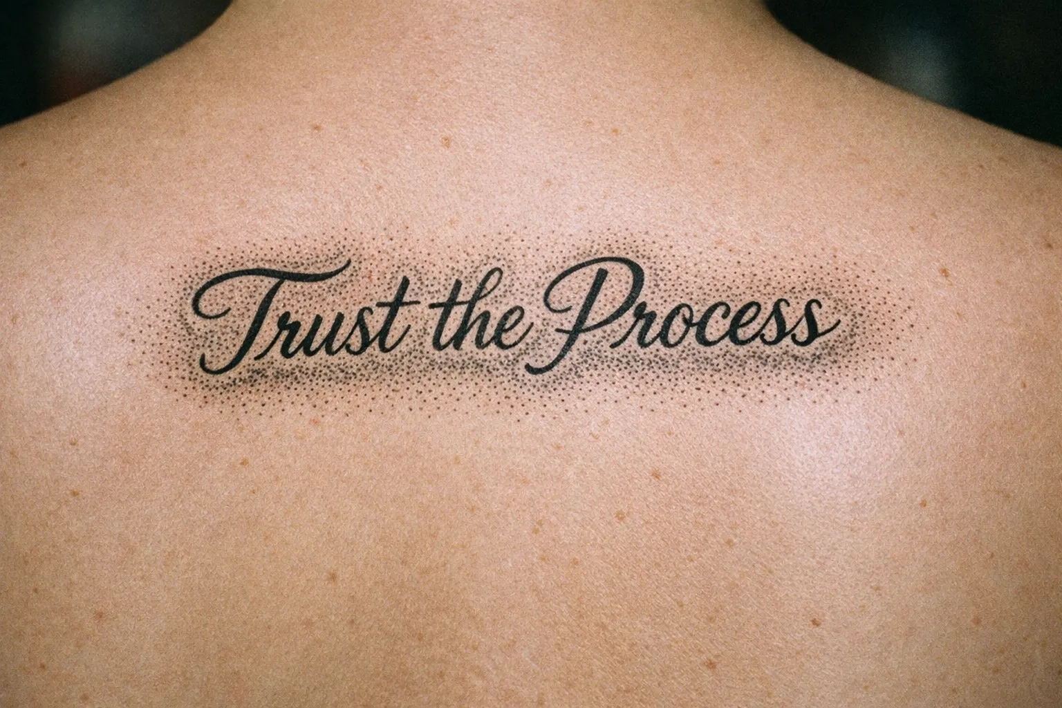
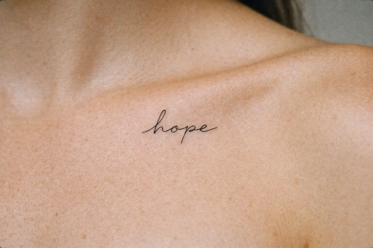
Fine-line and minimalist fonts are delicate and airy, built for a single word at a larger size in a low-friction placement. They carry the highest blurring risk of any family at small sizes. If you want this look, scale it up and put it somewhere with little movement: an inner forearm, not the side of a finger.
Script and Cursive Tattoo Fonts: Fine vs Bold and When Each Works
Script and cursive tattoo fonts are the most requested lettering category and also the most-regretted when chosen poorly. The difference between a fine script and a bold script at the same size determines whether the piece survives a decade. That distinction isn’t decorative, it’s structural.
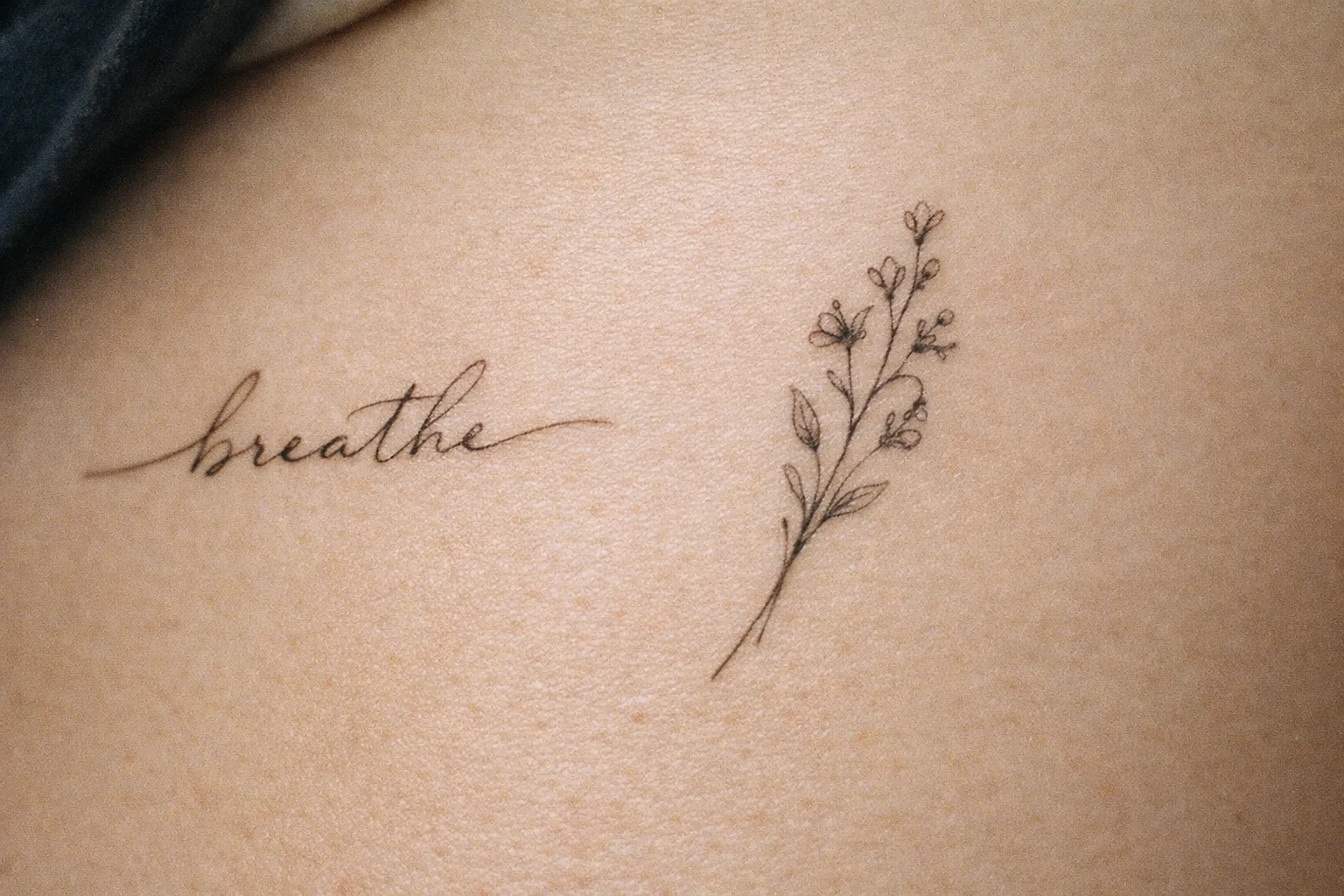
Fine script is delicate and airy, and its thin strokes close up as the tattoo ages. Bold script keeps its shape at smaller heights because thicker strokes have room to spread without merging. That’s why bold script is the safer default for names on the wrist and forearm. I’ve redrawn enough five-year-old fine-script wrist tattoos during consultations to say this without hesitation.
The size numbers back it up. Standard script stays readable if letters are at least ½ inch (12-13 mm) tall (1). Fancy or ornate script needs at least 1 inch (25 mm) so the swashes don’t merge as ink spreads (1). Ultra-fine cursive is risky enough at small sizes that one lettering specialist advises clients to honestly consider not getting it at all (1). Take that seriously: it’s the most-regretted category in the whole lettering world.
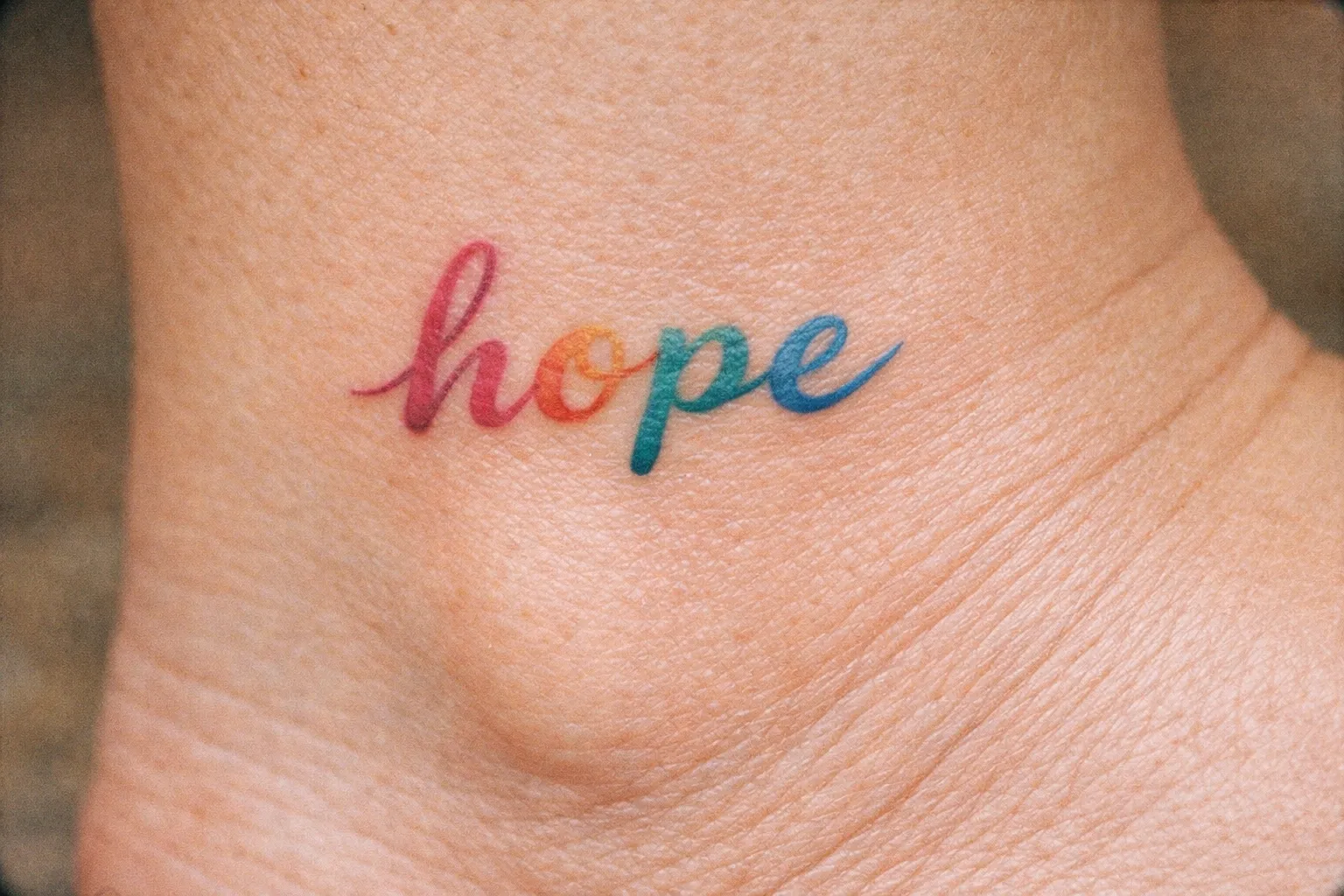
On subtypes: italic script gives you the classic fine-line look, bold cursive is the most popular cursive style for tattoos, calligraphic hand-lettering is a custom job, and Chicano script carries a distinct cultural origin from Mexican-American tattoo tradition (developed by Chicano artists in Los Angeles from the 1940s onward, drawing on Old English letterforms and Catholic illuminated manuscript lettering) and a heavier stroke weight that ages better than most fine scripts. Western calligraphy-based scripts trace back to European copperplate and Spencerian penmanship traditions; in modern tattoo culture they’ve shed most of their formal associations and now read simply as elegant or romantic depending on the piece.
A practical rule that holds up: keep script tattoos to roughly five words or fewer. Most readable script pieces span 3-6 inches in length, which is a natural ceiling for a short name or quote. Longer text needs a bolder, simpler variant, or it won’t hold spacing over time.
Bold cursive: the safer default for small placements
Bold cursive resists blurring because its thicker strokes leave less room for adjacent lines to close together, so it stays legible at smaller heights than fine script can manage. This is why it keeps coming up as the recommendation for wrist and forearm names. Put a bold cursive name and a fine script name side by side at the same height and the difference is obvious: the fine version already looks crowded before it has aged a day.
Fine script: when it works and when it doesn’t
Fine script works at larger sizes, 1 inch (25 mm) letter height or more, in low-friction placements like the inner forearm. It fails at tiny sizes on high-movement areas. A wrist script below the ½ inch (12-13 mm) standard-script floor loses legibility fast, because even minor line spread causes letters to close in there. The honest outcome: fine script that looked crisp at two weeks can look muddy at three years if it was too small or too busy. If you love the look, buy it insurance by going bigger and placing it somewhere calm.
Minimum Size Rules: The Numbers That Determine Whether Your Font Stays Legible
Minimum tattoo font sizes exist because ink spreads naturally over years, so thin strokes placed close together blur into each other unless they have room to spread apart. The whole point of a minimum size is to give the strokes that breathing room.
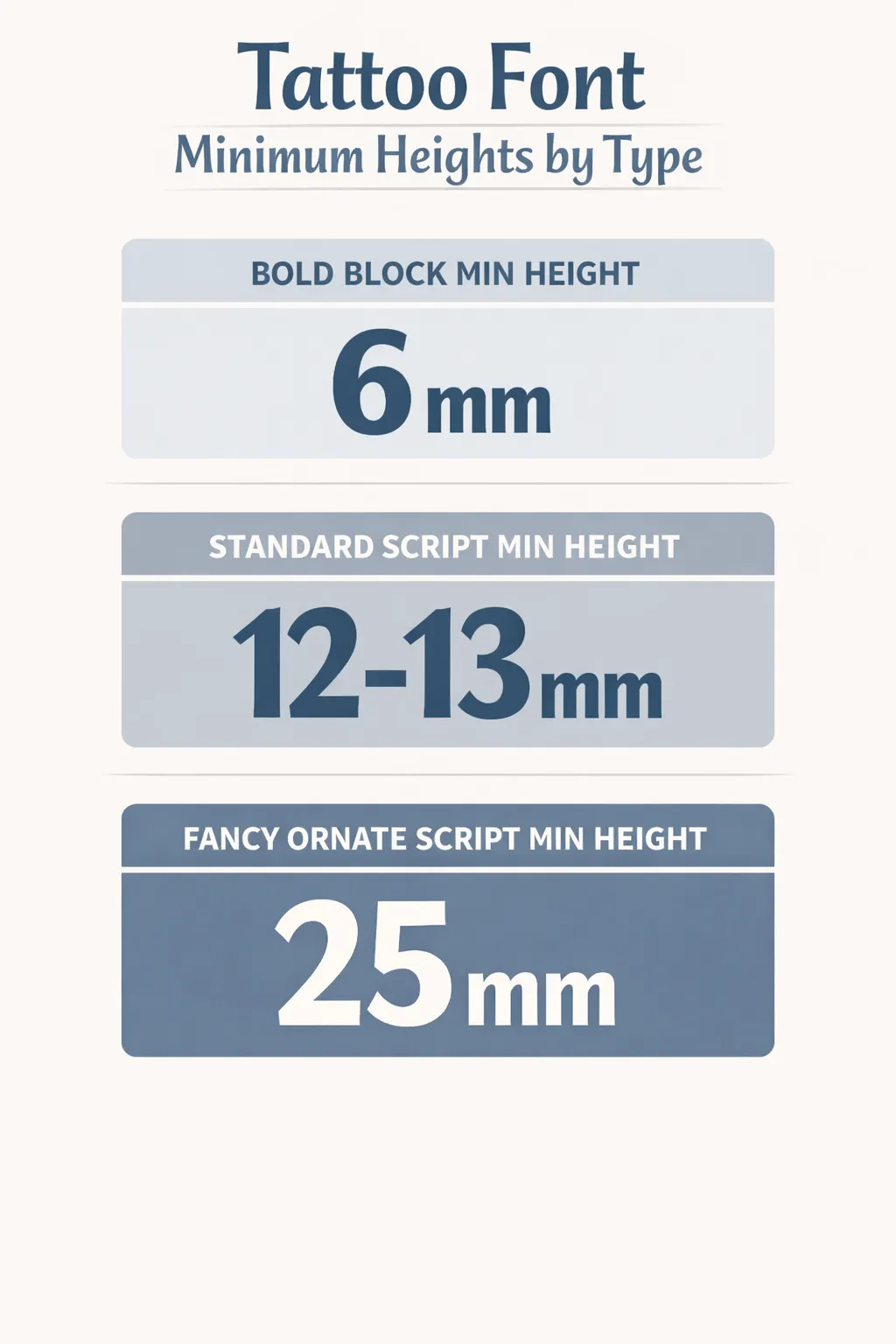 Bold block min height: 6 mm; Standard script min height: 12-13 mm; Fancy ornate script min height: 25 mm.
Here’s the four-tier size rule that consolidates the artist consensus:
The print-and-distance test: a two-minute check before you commit
The print-and-distance test is the single most useful check you can run before your appointment:
- Print the text at 100% scale, actual tattoo size, not a screen preview.
- Tape the printout to the placement area on your body.
- Step back about 10 feet (3 m).
- Read it. If you can’t read it easily, it’s too small or too busy.
- Increase the size, add stroke weight, or simplify the font, then reprint and repeat.
This one step catches more legibility problems than any amount of on-screen browsing. I tell every lettering client to do it before they come in. Most don’t. The ones who do almost always end up sizing up.
Minimum Tattoo Font Size Guidelines
| Bold / block (serif or sans-serif) | Standard script / cursive | Fancy / ornate script | Ultra-fine / minimalist cursive | |
|---|---|---|---|---|
| Font Type | Bold / block (serif or sans-serif) | Standard script / cursive | Fancy / ornate script | Ultra-fine / minimalist cursive |
| Minimum Letter Height | ¼ inch (about 6 mm) | ½ inch (about 12-13 mm) | 1 inch (about 25 mm) | Scale up or avoid at small sizes |
| Aging Risk | Low: thick strokes hold contrast | Medium: fine strokes blur over years | High: swashes merge and blur | Very high: most-regretted category |
| Best Placement | Forearm, upper arm | Inner forearm, collarbone | Ribcage, back, upper arm | Low-friction placements only |
| Notes | Most forgiving at small sizes | Bold variant safer at smaller heights | Requires skilled artist; simplify flourishes | Not recommended for wrist or finger |
Line weight matters alongside height. A stroke that’s too thin when healed keeps thinning until it breaks up, and fingers and feet, where friction is highest, need the most margin.
Connect size to placement. A collarbone or spine piece has a natural length constraint, so you plan the text around it. A forearm or back piece has room, so go to the larger end of the range. When in doubt, bigger wins: larger text almost always ages better and stays readable from a distance.
One trap worth naming: fonts designed for print or posters carry fine details that vanish when shrunk to body-text sizes. A digital preview at 100% zoom on a monitor is not the same as a printout at actual tattoo size, which brings us to the test that catches most problems.
Generators: How to Use Them Without Getting Burned
A tattoo font generator lets you type your text and preview it in anywhere from 10 to 50-plus lettering styles in real time, sorted by family (cursive, gothic, bold, handwritten, serif, graffiti, typewriter), with no design software needed. Fast, useful, and easy to misuse.
The main tools split into two types. Some are Unicode copy-paste generators: FontVibe lets you tap any style to copy Unicode-styled text you can paste into a message or social post to share with your artist, and UltraTextGen works the same way. These are for sharing ideas, not for stencils. Others are AI-based and output stencil-ready images: OpenInk offers eight style categories (cursive, calligraphy, gothic, handwritten, serif, sans-serif, typewriter, and graffiti) and converts your result to a clean stencil for download, and InkStudioAI advertises 50-plus lettering styles for names, quotes, or mantras (9). iTextKit leads with Old English blackletter, gothic, and elegant script, and renders every style in one list so you can scan them side by side (6).
The generator features actually worth using are the ones that stress-test a font before you print it:
- Stroke thickness adjustment: thicken a fine script to see if it survives.
- Letter spacing control: open up the gaps so letters don’t touch when ink spreads.
- Size slider: view the same text large and small to watch how thin strokes close up at smaller scale. That preview simulates aging better than looking at one size.
The critical caveat: generators produce digital font previews, not tattoo-ready artwork. Bring the output as a style reference. Your artist will redraw it, adjusting spacing, line weight, and flourishes for your specific body area and size. Asking them to trace the digital font exactly is asking for a tattoo that was designed for a screen, not for skin.
What to bring to your artist consultation
Print the generator output at actual size. Note the style name and the specific changes you want: bolder strokes, fewer flourishes, tighter or looser spacing. Then let the artist redraw it as tattoo-ready linework. A good tattooer will adapt any stock font before it ever touches skin, because the font as displayed almost never has the stroke weight or spacing a tattoo needs to last.
Placement and Font Pairing: Matching the Style to the Body Area
Placement determines three things at once: the maximum size available, how much the skin moves, and how fast fine strokes degrade. The same font can be a reasonable choice on the inner forearm and a bad one on the wrist. Same font, different outcome.
Here’s how the main placements pair with fonts:
- Forearm (inner): flat, roughly 9-11 inches of surface. Suits bold script, block, or blackletter at 3-5 inches. Thin script blurs here over time.
- Wrist: high movement, faster fading. Short names or initials only, and it ages faster than almost anywhere else on the body. Keep designs under 2-3 inches overall, which leaves room for initials or a short word at the general floors: ¼ inch (6 mm) for block, ½ inch (12-13 mm) for bold script. Avoid fine-line cursive.
- Collarbone / sternum: elegant for a single name in fine script at a larger letter height. Sternum pain is sharp as you move toward the ribs, noticeably more than the forearm. Easy to cover with clothing.
- Ribcage / side: discreet, higher pain than the forearm. Suits medium-to-large bold or blackletter; fine-line is possible at larger sizes.
- Spine: natural vertical flow, good for a single word or short phrase in script or fine-line. Length-constrained by the run of the spine.
- Behind the ear / finger: very short text only, 1-2 inches. Highest fade rate on the body. Avoid fine-line scripts entirely and expect touch-ups; finger work often needs one around 18 months.
Low-friction placements like the inner forearm are safer for finer fonts than high-friction ones like the side of a finger or the wrist. And this ties straight back to the size rules: a wrist has less room, so bold script at a smaller height is a safer bet than fine script at the same height. When the placement fights you, pick the bolder, simpler font.
Classic Pitfalls: The Font Choices That Age Badly
Every one of these mistakes traces back to the same physics: ink spreads, thin strokes merge, and decorative detail disappears. The fixes are all variations on the same answer: go bolder, go bigger, go simpler.
Over-flourish and ornate swashes. Decorative loops that look elegant on-screen blur quickly, merge with neighboring letters, and become unreadable. The more decorative the font, the larger it needs to be: fancy or ornate script needs at least 1 inch (25 mm) of letter height (1). If you want swashes, buy them the size they need.
Ultra-fine cursive at small sizes. The most-regretted category. Thin strokes thicken and delicate curves turn into blobs as the tattoo ages. If you want fine script, scale it up or choose a bolder variant; do not shrink it onto a wrist.
Blackletter for long text or small placements. Old English becomes a dense, unreadable block when too many letters crowd together or the size drops too low. Keep it to single words or very short phrases. A full sentence in blackletter at small size is a guarantee of future regret.
Poor spacing. Letters should not touch, words need obvious gaps, and multi-line quotes need real line spacing. Natural ink spread will blur tight letters and even whole lines into each other, and it’s worst in multi-line quotes. Loose spacing is cheap insurance.
Approving a design only on-screen. Viewing a font on a monitor at an arbitrary zoom is not the same as printing at actual tattoo size and reading it from 10 feet. Skipping the print test is one of the most common pre-appointment mistakes there is.
Using print or poster fonts at tattoo scale. Fonts built for large-format print carry fine details that disappear or merge when shrunk to body-text sizes. A font that looks stunning on a poster can be a poor tattoo font at 2 inches.
How to Choose: A Practical Decision Process
Choosing among the best tattoo fonts for your piece is a five-step sequence that takes you from blank slate to a font reference ready for your artist consultation.
How to Choose a Tattoo Font in 5 Steps
15 minutesA practical sequence from text selection to artist consultation.
- 1
Lock in the exact text
Finalize spelling, names, or dates before browsing fonts; keep script pieces under five words; last-minute changes force redesign.
- 2
Pick a font family
Match the family to the text type and emotional register: block for dates, script for names, blackletter for drama.
- 3
Confirm placement and size ceiling
Body area sets max size and friction; high-movement areas demand bolder, simpler fonts.
- 4
Preview in a generator
Use tools like OpenInk or FontVibe; adjust stroke thickness and spacing; check font at multiple sizes with slider.
- 5
Print at actual size and run the 10-foot test
Tape printout to placement, step back about 3 m, check legibility; bring printout as style reference to artist.
Frequently Asked Questions
Frequently Asked Questions
- What is the most popular tattoo font style?
- Bold cursive/script is the most requested overall; block and serif fonts top for dates and coordinates.
- What tattoo fonts age the best?
- Bold and block fonts age best due to thick strokes; bold script is next safest; ultra-fine cursive ages worst.
- How small can a tattoo font be and still stay legible?
- Bold or block fonts need a minimum of about ¼ inch (6 mm); standard script ½ inch (12-13 mm); ornate script 1 inch (25 mm).
- Is Old English or blackletter a good tattoo font?
- Good for single words or short phrases at medium-large sizes; poor for long sentences or small placements.
- What tattoo fonts work best for names?
- Bold or italic script for warmth; block or sans-serif for clean, lasting results; avoid ultra-fine cursive on wrist or finger.
- Can I use any font I find online for a tattoo?
- Yes as a style reference; artists must adapt fonts by thickening strokes and opening spacing for tattoo use.
- Why does my fine-line script look crisp when fresh but blurry later?
- Ink spreads through skin over time; thin strokes placed close together merge first; bolder, bigger fonts prevent this.
Before You Book: The Three Things That Actually Determine How Your Font Holds Up
Three decisions drive the long-term outcome. Everything else is detail.
Font weight. Bold strokes survive; ultra-fine strokes don’t, no matter how good they look on the day you get them. If you’re torn, go thicker.
Size. Treat the minimum thresholds as a floor, not a target: ¼ inch for bold, ½ inch for standard script, 1 inch for ornate. Bigger is almost always safer.
Placement. Low-friction areas like the inner forearm and collarbone give fine fonts their best chance. High-movement areas like the wrist and finger demand the boldest, simplest option you can live with.
Aftercare. Lettering tattoos need clean healing to hold their linework. Days 1-3: keep the area clean with unscented soap and apply a thin layer of fragrance-free moisturizer two to three times a day; no soaking, no sun. Week 1: the surface will peel; do not pick it, or you pull ink out of fine strokes and break up the linework. Weeks 2-4: the skin looks healed but the ink is still settling; keep it out of direct sun and use sun-protective clothing over the piece when you’re outside. Fine-line and script tattoos are more vulnerable to UV fading than bold or block styles, so that last point matters more here than it does for a thick blackletter piece.
Then do the one thing that catches more problems than any amount of online browsing: print your chosen font at actual size, tape it to the placement, and read it from 10 feet before your consultation. If it fails there, it will fail on your skin.