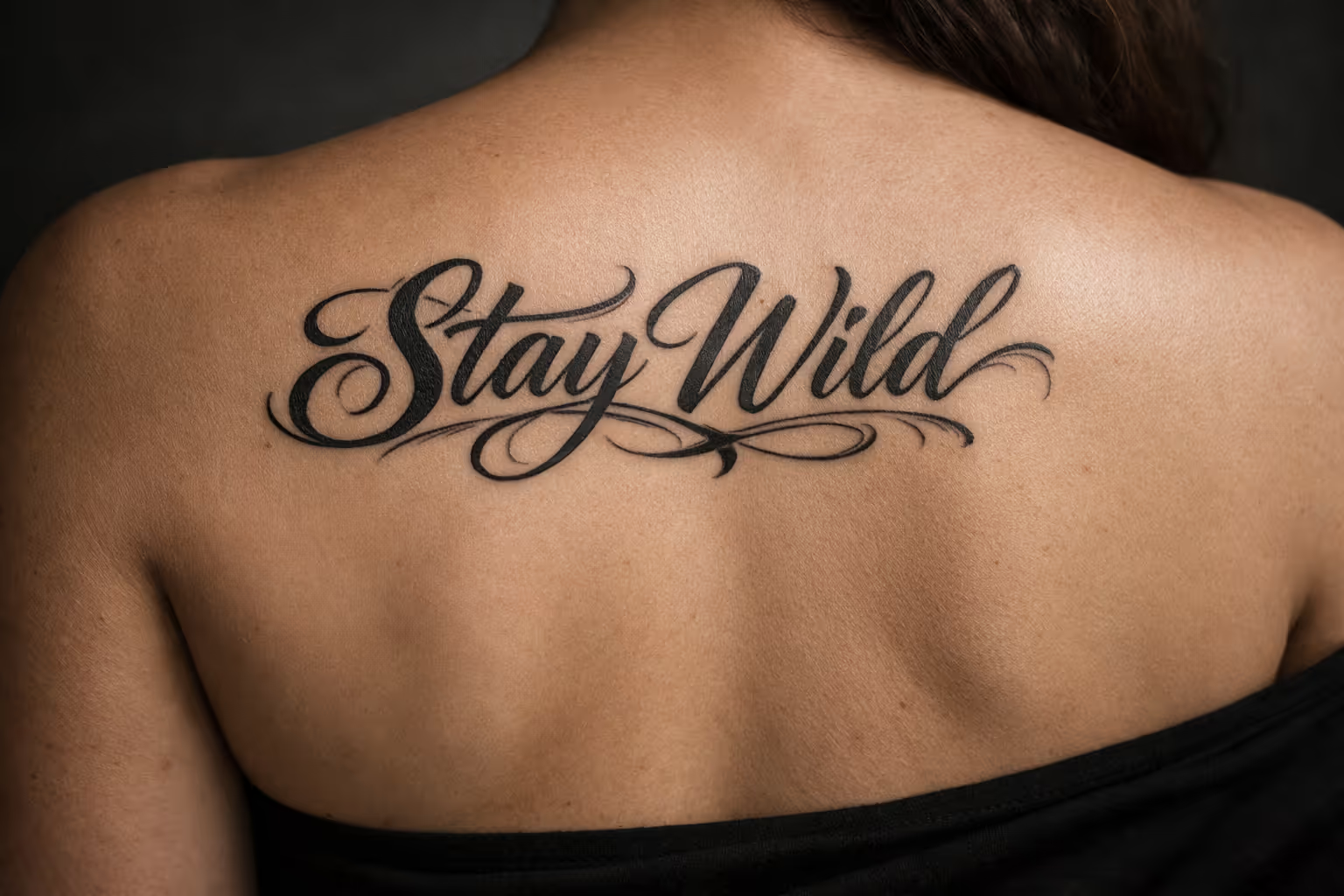
The most common lettering tattoo regret isn’t the words. It’s the font someone picked off a reference sheet in the last ten minutes before the needle came out. A lettering tattoo is typography on skin, and the decisions that actually determine whether your text still reads at 40 are made at the consultation - not in the chair. Font weight, letter height, and placement do all the work, because there’s no imagery or shading to fall back on if the design fails. This guide covers every major style, how each one ages, where each holds up on the body, and what to confirm before you book.
Get those choices right and a word tattoo holds up for decades. Get them wrong and you’re looking at laser or a cover-up within a few years.
✓ Pros
- Highly personal - exact words carry precise meaning
- Wide style range suits any aesthetic
- Can be discreet (wrist, collarbone) or bold (chest, back)
- Shorter sessions and lower cost for simple pieces
- Works as standalone or integrated with imagery
✗ Cons
- Font and size mistakes are permanent and expensive to fix
- Fine-line scripts blur and close up within 5-10 years if undersized
- Spelling errors are irreversible without laser or cover-up
- Stretch-prone placements (stomach, inner thigh) distort letterforms
- Requires a lettering specialist - not every artist is equally skilled
What a Lettering Tattoo Actually Is (and What It’s Called)
A lettering tattoo is any design built primarily around words, numbers, or phrases rendered in a specific font or script - as opposed to imagery-first tattoos where the picture carries the piece (10). Names, dates, short quotes, coordinates, foreign-language phrases, single words. If the text is the point, it’s lettering.
The terms shift around a shop, and they mostly mean the same thing. “Tattoo lettering,” “script tattoo,” and “lettering tattoo” get used interchangeably in practice. Within specific styles you’ll hear more precise vocabulary: blackletter or gothic for the angular medieval look, calligraphy for ornate pen-based scripts, Chicano for the ornamental style rooted in California Latino culture.
The craft has its own technical language, and it matters when you talk to an artist. Linework, stroke weight, baseline, kerning (the spacing between letters), and flourishes are the terms a good letterer uses to describe why a design will or won’t hold up. When someone says the kerning is too tight, they mean the letters will close into a blur as the ink spreads.
Because there’s no shading or imagery to carry the design, the font, size, and placement do all the work. That’s the whole reason lettering fails more often than most categories - and why spelling and placement need to be locked down before the session begins (2).
The Main Lettering Tattoo Styles, Broken Down
Lettering tattoos span several style families, each with its own technical demands and aesthetic character, and the choice decides how the piece reads at a distance and how it ages (10). Treat this section as a decision tool: match the style to the emotional tone of the text and to the placement you have in mind. A style that reads beautifully on the chest can be unreadable on a wrist.
Script and Cursive Lettering
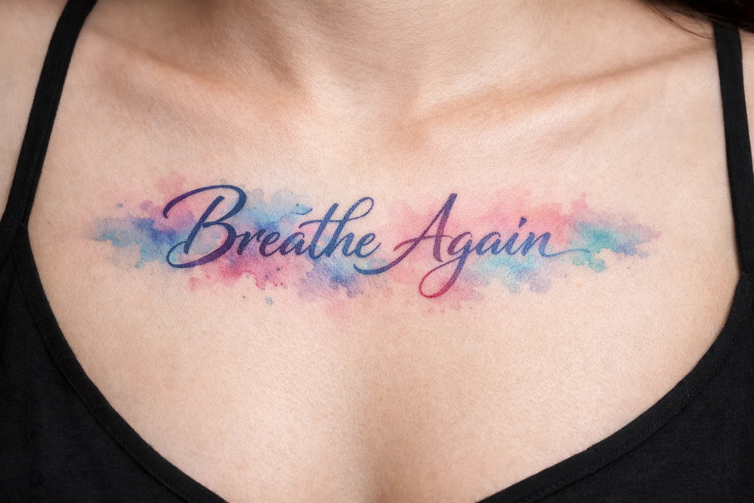
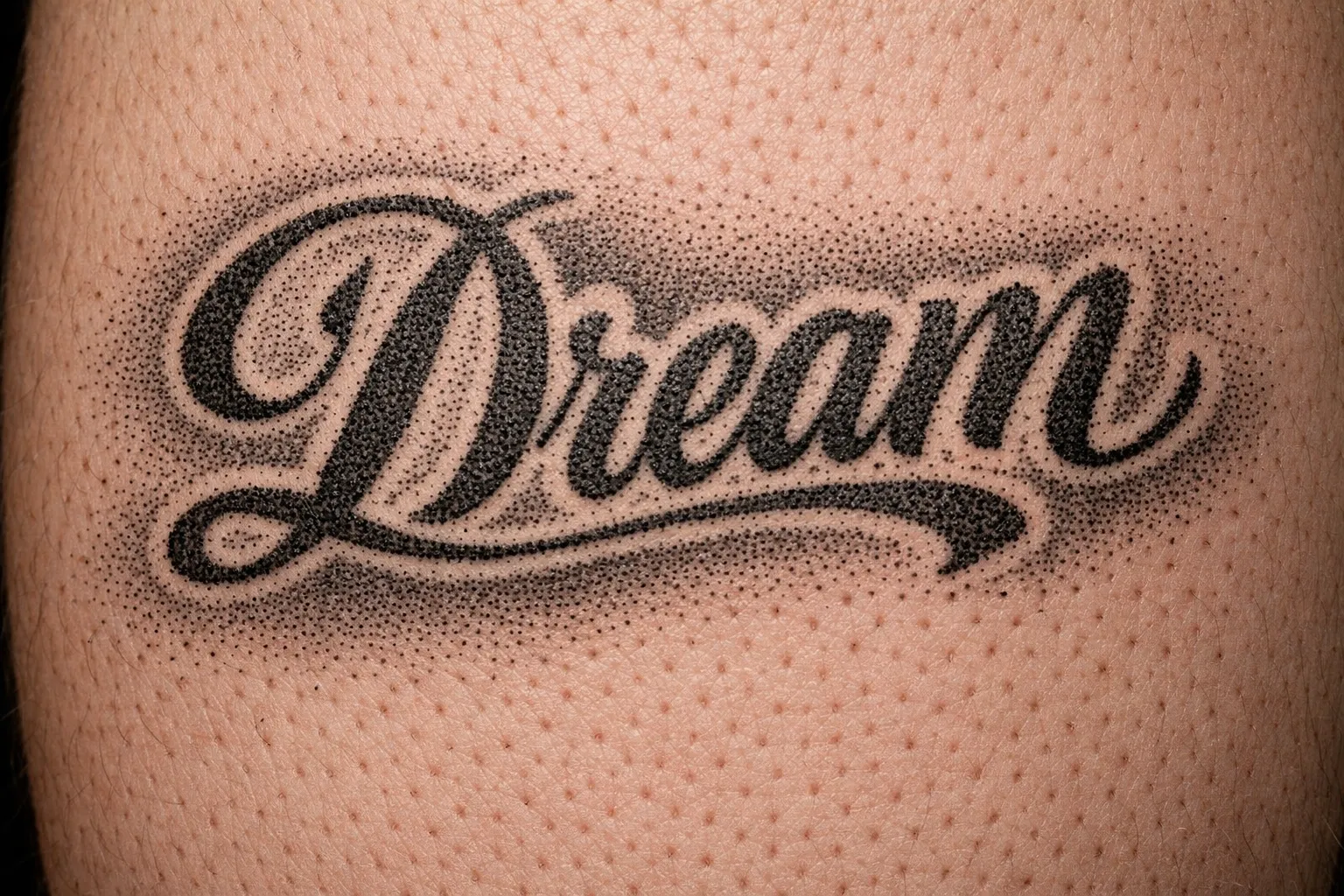
Script is flowing, connected letterforms derived from handwriting and calligraphic traditions, and it’s the most requested category in tattooing (10). It splits into two subtypes that age very differently. Fine script is delicate and airy with thin strokes - beautiful fresh, high blowout risk over time. Bold script uses thicker strokes and holds its shape for far longer.
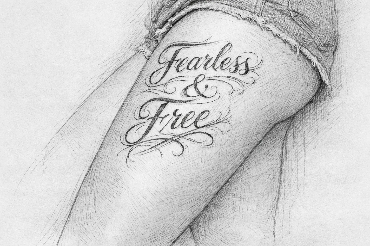
A cursive lettering tattoo suits personal quotes, names, and romantic lines where emotional tone matters. Keep standard script at a minimum letter height of ½ inch (12-13 mm), and push ornate or fine variants to 1 inch (25 mm). The aging risk on fine script is real: thin strokes thicken and loops can close within 5 to 10 years. Bold script ages significantly better. Best placements are flat, low-stretch surfaces - inner forearm, collarbone, upper back.
I’ve watched clients come back five years after a delicate fine-script piece on their inner wrist and the loops had already started closing. The tattoo wasn’t ruined, but it was heading there. The same text in a slightly heavier stroke on the inner forearm would have held clean.
Gothic and Blackletter
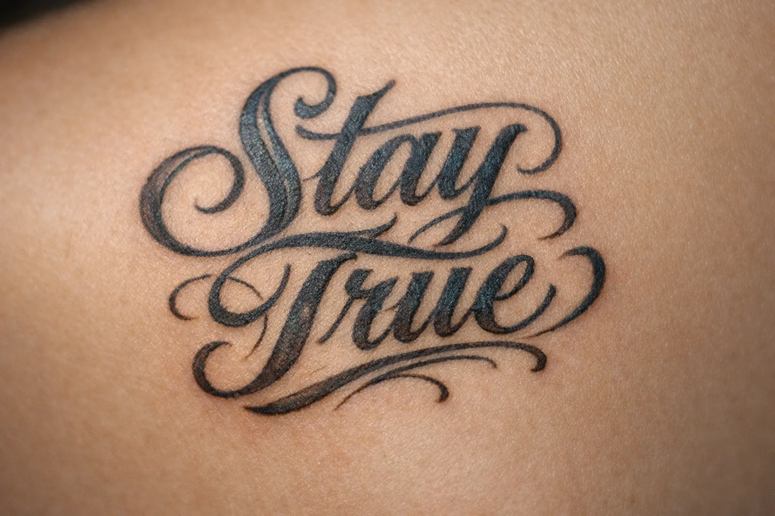
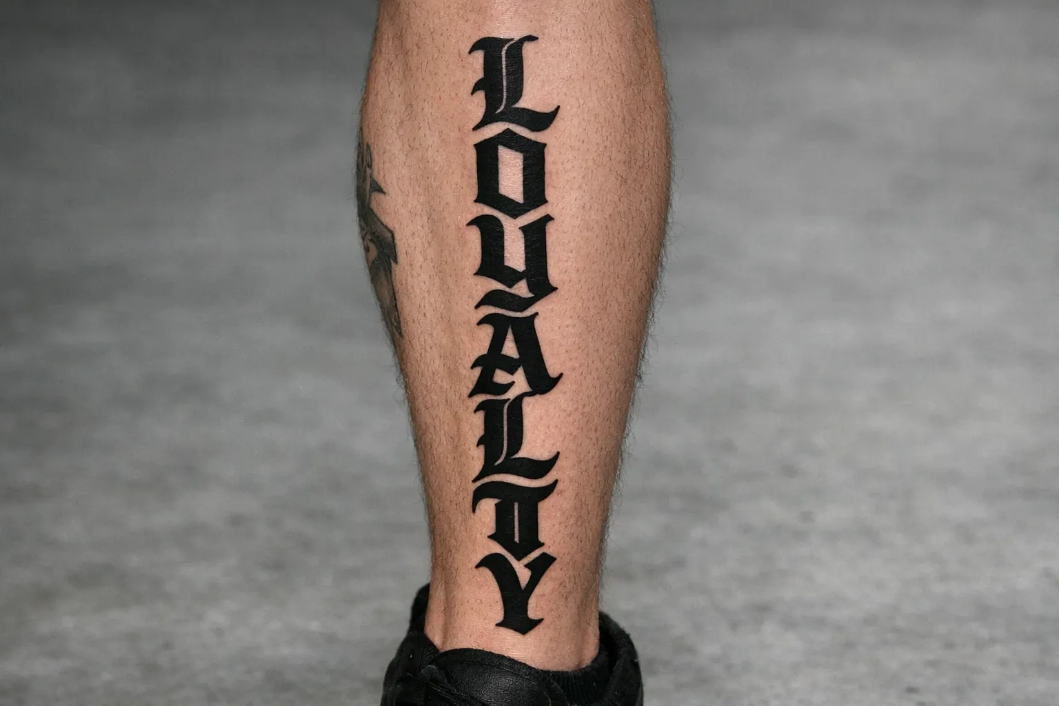
Gothic and blackletter is dense and angular - thick vertical strokes, thin diagonal hairlines, ornate serifs. That’s the hallmark of the Old English look (2)(12), and it’s rooted in medieval European manuscript tradition. It was heavily adopted in American traditional tattooing and Chicano culture, and for good reason: it was built for permanence.
This style is made for short words, names, and slogans where visual weight matters more than quick readability. Aging risk is low - the thick strokes hold contrast well. What kills it is cramming. A long phrase or a small size turns blackletter into an unreadable block. Give it room on the chest, forearm, or upper back.
Serif and Roman Lettering
Serif and Roman lettering draws on Roman stone inscriptions - clean, architectural, structured, formal. Aging risk is low to medium; the serifs can thicken slightly over the years but the overall form holds.
This is the style for Latin phrases, formal quotes, dates, and coordinates - anywhere legibility over decades matters most. It works best on flat areas where the baseline stays straight: forearm, upper arm, sternum.
Minimalist and Fine-Line Lettering
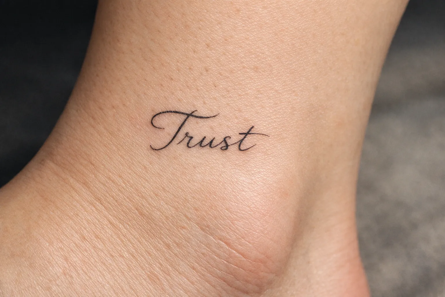
Minimalist and fine-line lettering relies entirely on line quality - single-needle or very fine groupings, no shading, no decorative elements (10). It’s popular for discreet dates, coordinates, and single words.
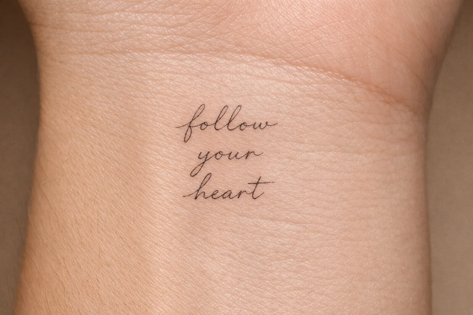
The critical caveat: go about 30% larger than your first idea (7). Ink spreads, and fine lines are the first to blur. Fine fonts need about 1 inch (25 mm) of letter height, for dates and short names alike. Best placements are low-friction, low-stretch areas - inner arm, collarbone, sternum. This style carries the highest aging risk of all, and long-term sunscreen isn’t optional if you want it to survive.
Chicano Lettering
Chicano lettering is highly ornamental - complex shading, flourishes, and decorative fills, rooted in the Chicano movement of the 1960s and 1970s and developed in the prisons and barrios of East Los Angeles (10). It’s often used for family names, religious phrases, and barrio references, and it carries deep cultural significance.
This is a distinct craft with its own training lineage, so it needs a specialist. Aging risk is medium: the shading and weight give it more staying power than fine line, but the ornamental detail softens over time. It needs real estate - chest, upper arm, forearm.
Typewriter and Graffiti Lettering
Typewriter fonts are monospaced with a vintage, literary feel - well suited to coordinates, dates, and literary quotes, sometimes finished with a small period for a sense of finality. The uniform stroke weight means it ages well. Forearm and upper back are natural fits.
Graffiti lettering is bold and stylized with a street-art aesthetic, good for nicknames, short statements, and rebellious phrases. It can get complex enough to need a specialist. Give it weight on the chest or upper arm.
Matching Font to Meaning - Why the Wrong Style Kills the Design
Font style communicates tone independently of the words. The same word “hope” reads soft and emotional in a delicate script and bold, even intimidating, in gothic lettering - the letterforms set the emotional register before anyone reads a syllable (6). This is the part most people skip, and it’s why two people can tattoo the identical phrase and walk away with completely different pieces.
Here’s the practical matching guide. Modern calligraphy or cursive suits romantic, personal, intimate text. Roman serif fits solemn, formal, memorial phrases and Latin. Gothic and blackletter carry heritage, strength, and weight. Fine-line minimalist works for subtle, private coordinates and dates. Graffiti reads as rebellious and identity-driven for nicknames. Typewriter feels literary, vintage, sometimes ironic. Chicano signals family, faith, and community - and only with a specialist.
The mismatches are easy to spot once you look for them: playful brush lettering on a memorial phrase, harsh gothic on a gentle affirmation. Both create a dissonance that’s hard to articulate but immediately felt. A simple test: read the text aloud in the “voice” of the font. If the voice doesn’t match the meaning, the font is wrong.
Font-to-Meaning Matching for Lettering Tattoos
| Bold script/cursive | Fine-line script | Gothic/blackletter | Roman serif | Chicano | Typewriter | Graffiti | Fine-line minimalist | |
|---|---|---|---|---|---|---|---|---|
| Best Text Type | Names, romantic quotes | Dates, single words | Short words, heritage | Latin phrases, formal quotes | Family names, religious phrases | Coordinates, literary quotes | Nicknames, statements | Coordinates, single words |
| Aging Risk | Medium | High | Low | Low-medium | Medium | Low | Medium | High |
| Minimum Size | ½ in (12-13 mm) letter height | 1 in (25 mm) letter height | 2 cm letter height | ¼ in (6 mm) letter height | 3+ cm letter height | ¼ in (6 mm) letter height | 3+ cm letter height | 1 in (25 mm) letter height |
| Ideal Placement | Inner forearm, collarbone | Sternum, inner arm | Chest, forearm | Forearm, upper arm | Chest, upper arm | Forearm, upper back | Chest, upper arm | Collarbone, sternum |
Font generators like FontVibe, OpenInk, and iTextKit are useful for previewing style options before your consultation. Bring them as reference, not as a final blueprint - digital fonts aren’t built for skin, and your artist will need to adapt spacing and stroke weight anyway.
Placement and Size - Where Text Works and Where It Warps
The fundamental rule: flat, low-stretch skin holds letterforms, while curved, stretchy skin distorts them (7). That single principle decides more about your tattoo’s long-term legibility than the font does.
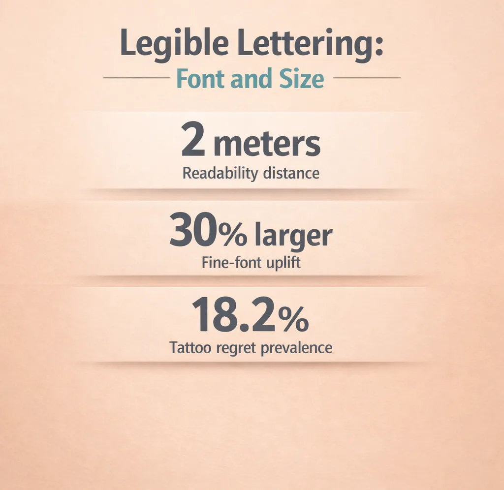 Legibility targets for lettering tattoos: 2 m readability; 30% fine-font uplift; 18.2% regret.
Run the readability test before you commit. Print the font at actual tattoo size, tape it to the body, and confirm it reads clearly at arm’s length and from 2 meters away (7). If it doesn’t read at that distance, increase the size or simplify the font. It’s a rough rule, but it’s the one letterers work to for long-term legibility.
The minimum height rules are concrete:
- ¼ inch (6 mm) for dates and words in bold block fonts
- ½ inch (12-13 mm) for names in standard script
- 1 inch (25 mm) for names or words in fine or ornate fonts
- Fine fonts should be tattooed about 30% larger than your initial idea
Best Placements by Body Area
Inner forearm is flat, with roughly 9 to 11 inches of usable length - enough for sentences and quotes. It reads well and suits script, serif, and typewriter. The high visibility cuts both ways: if the text doesn’t hold up, you’ll see it every day.
Collarbone and clavicle are elegant for a single name or short phrase in fine script; 3 to 6 inches works well. Pain is moderate, and clothing covers it easily.
Upper back is a large flat canvas that suits longer passages, gothic pieces, and multi-line quotes. It ages well with low distortion risk.
Ribcage and side stay discreet and coverable, and suit longer quotes running vertically or horizontally. Pain is higher than the forearm - ribcage is noticeably sharper than the inner arm, and long sessions there are genuinely difficult. Avoid it if you anticipate significant weight change.
Sternum is a strong central placement for single words or short phrases, and suits fine-line and Chicano work. Pain is sharp near the bone.
Wrist works for short names or dates at 1 to 3 inches. High movement means faster fading, so expect touch-ups sooner.
Spine is dramatic for longer passages and suits script and serif, but the artist has to work in sections.
Placements to Avoid (or Approach with Caution)
The stomach and lower belly are stretch traps: weight change and pregnancy warp letterforms so badly that clean text can become unrecognizable. The inner thigh carries the same distortion risk. Fingers and hands have the highest fade rate of any placement - fine-line scripts are not recommended there, and touch-ups are frequent. Behind the ear works only for very short text, one or two letters or a tiny date, because the skin texture fades faster. One regret study found tattoos on the hands, wrist, or fingers were more likely to be regretted than those elsewhere (16), which lines up with how poorly those spots hold fine linework.
How Long They Last, and What Aging Actually Looks Like
Yes, lettering tattoos last. But “lasting” and “remaining legible” are two different questions, and the second is the one that matters.
Here’s what happens physically. Ink spreads outward from the original line over years. Thin strokes thicken, spacing closes, loops fill in. This is normal and inevitable, not a sign of bad work - it’s why the community saying “go bold or go home” exists. A delicate thin-stroked script that looks immaculate the day it heals can become an illegible smear within 5 to 10 years if the lines were packed too tightly.
Aging by style:
- Fine-line minimalist can start showing legibility loss within 5 to 7 years if undersized - the most vulnerable style.
- Bold script and cursive hold well for 10 to 15+ years with good placement and sun protection.
- Gothic and blackletter age best - thick strokes stay readable at 20+ years in good placements.
- Chicano is medium-term; the shading gives it staying power but the ornamental detail softens.
The factors that accelerate aging are predictable: sun exposure, stretch-prone placement, very small size, and tight letter spacing. Sunscreen on healed tattoos is the single most effective way to slow fading and preserve line definition - for fine-line scripts, it’s non-negotiable.
On the timeline: the visible outer layer looks healed within about 2 to 3 weeks, but the deeper skin layers beneath it can take up to a year to finish healing (17). Don’t judge the final result until several months in - fine-line script can look crisp at two weeks and shift noticeably as the skin settles.
Aftercare for Lettering Tattoos
1 monthProper healing keeps lines crisp and legible.
- 1
Days 1 to 3
Keep the area clean with fragrance-free, dye-free soap. Apply a thin layer of fragrance-free moisturizer 2 to 3 times daily. Avoid over-moisturizing to prevent ink loss.
- 2
Days 4 to 14
Peeling is normal; do not pick. Continue light moisturizing and avoid pools, baths, and soaking for the full 2 to 4 weeks.
- 3
Weeks 2 to 4
Outer skin looks healed but deeper layers are settling. Avoid direct sun and wear loose or sun-protective clothing over the tattoo.
- 4
Long-term
Apply SPF 30+ sunscreen whenever the tattoo is exposed to sun. This is essential for preserving fine-line and minimalist scripts.
Mistakes That Turn a Good Idea Into a Regret
Tattoo regret isn’t rare - one study found 18.2% of tattooed U.S. adults regretted at least one tattoo (16). With lettering, the failure modes are predictable, which means most of them are avoidable.
Going too small or too tight. The most common technical mistake. Letters merge into a black blur as ink spreads (1). If you can’t read it clearly at arm’s length when it’s fresh, it won’t survive 10 years.
Skipping the spelling check. Triple-check spelling and grammar, and have someone else read the stencil before the needle touches you (1). For foreign-language text, verify with a native speaker - not Google Translate alone. This is the single most documented source of permanent regret in word tattoos. I’ve seen it happen. It’s not a fun conversation.
Choosing a decorative font for a long quote. Gothic and ornamental scripts suit short words, not passages. A 20-word quote in blackletter becomes an unreadable block.
Placing text on stretch-prone skin. Stomach, lower belly, inner thigh - weight change and pregnancy distort letterforms in ways that can’t be corrected without laser or a cover-up. The same regret study flagged the head or neck and the hands, wrist, or fingers as higher-odds regret sites (16).
Booking a generalist for a specialist style. Chicano lettering, complex gothic, and fine calligraphy require specific training. Poor line control produces wobbly baselines and inconsistent stroke weights. Look at an artist’s lettering portfolio specifically, not their overall work.
Mismatching font to mood. Covered above, but it belongs here too - the wrong font undermines the meaning even when the execution is technically clean.
Not accounting for ink spread in the design. Tight letter spacing that looks elegant on screen closes up on skin. A good artist builds in more spacing than the digital preview shows.
Ideas by Content Type
Organizing by what people actually want to tattoo makes the decisions concrete.
Names - children, family, memorial. Lower regret risk than partner names, since they mark lineage or remembrance rather than a changing relationship. Bold or block fonts at 2+ inches hold contrast for decades. Inner forearm and upper arm are the most reliable placements.
Dates and coordinates suit minimalist or fine-line and typewriter fonts. Keep to at least ¼ inch (6 mm) in a bold typewriter or block font, and about 1 inch (25 mm) if you go fine-line. Ribcage and collarbone work well.
Short quotes of 3 to 5 words are the sweet spot for lettering. Long enough to carry meaning, short enough to size correctly. Both script and serif work, and forearm and upper back are natural fits.
Single words are the most forgiving format - they allow larger sizing, more decorative fonts, and more placement flexibility. Gothic and Chicano shine here.
Foreign-language phrases in Latin, Arabic, or Japanese are high impact and high risk. Verify with a native speaker before finalizing (1). Latin phrases in Roman serif age particularly well. Arabic and Japanese kanji require specialist artists familiar with the script - Arabic is written right to left with diacritics that change meaning, so this is not a job for a generalist working from a printout.
Affirmations and memorial phrases need font weight matched to emotional tone. A solemn memorial reads better in Roman serif or restrained script than in playful brush lettering. The script tattoo lettering you choose for something that marks a loss should carry the right register, not just the right words.
Frequently Asked Questions
Frequently Asked Questions
- What is a lettering tattoo?
- A lettering tattoo is any design built primarily around words, numbers, or phrases rendered in a specific font or script - from gothic blackletter to fine-line cursive.
- What is tattoo lettering called?
- The terms "tattoo lettering," "script tattoo," and "lettering tattoo" are used interchangeably. Specific styles include blackletter, calligraphy, and Chicano lettering.
- What's a good font for a tattoo?
- Bold script suits names and quotes; Roman serif fits formal phrases; gothic works for short words. Fine-line fonts need about 30% larger size for longevity.
- Do lettering tattoos last?
- They last, but legibility varies. Thick-stroke styles remain readable 20+ years; fine-line scripts can blur within 5-7 years without proper care.
- How small is too small for a lettering tattoo?
- Minimum letter heights: ¼ inch (6 mm) for bold block fonts and dates, ½ inch (12-13 mm) for standard script, 1 inch (25 mm) for fine or ornate fonts.
- Can I use any font I find online for a tattoo?
- Online fonts can be references, but artists must adapt spacing and stroke weight for skin and ink spread.
- How do I avoid spelling mistakes in a lettering tattoo?
- Triple-check spelling yourself, have someone else verify the stencil, and for foreign languages, consult a native speaker.
Three Decisions That Actually Determine Whether This Holds Up
Style matched to the emotional tone of the text, size large enough to survive ink spread, placement on flat low-stretch skin. Get those three right and most of the failure modes disappear.
One action prevents most regrets before you even book: print the font at actual size, tape it to the body, and read it from 2 meters away. If it doesn’t read there, it won’t read in ten years.
One artist-selection point matters more than any other - look at their lettering portfolio specifically, not their overall work. Line control for text is a distinct skill, and a strong flash artist isn’t automatically a strong letterer.
Once it’s healed, keep sunscreen on it. SPF on healed text is the difference between a tattoo that reads clearly at 40 and one that’s a soft grey blur. For fine-line scripts, that’s not aftercare theater. It’s the whole game.