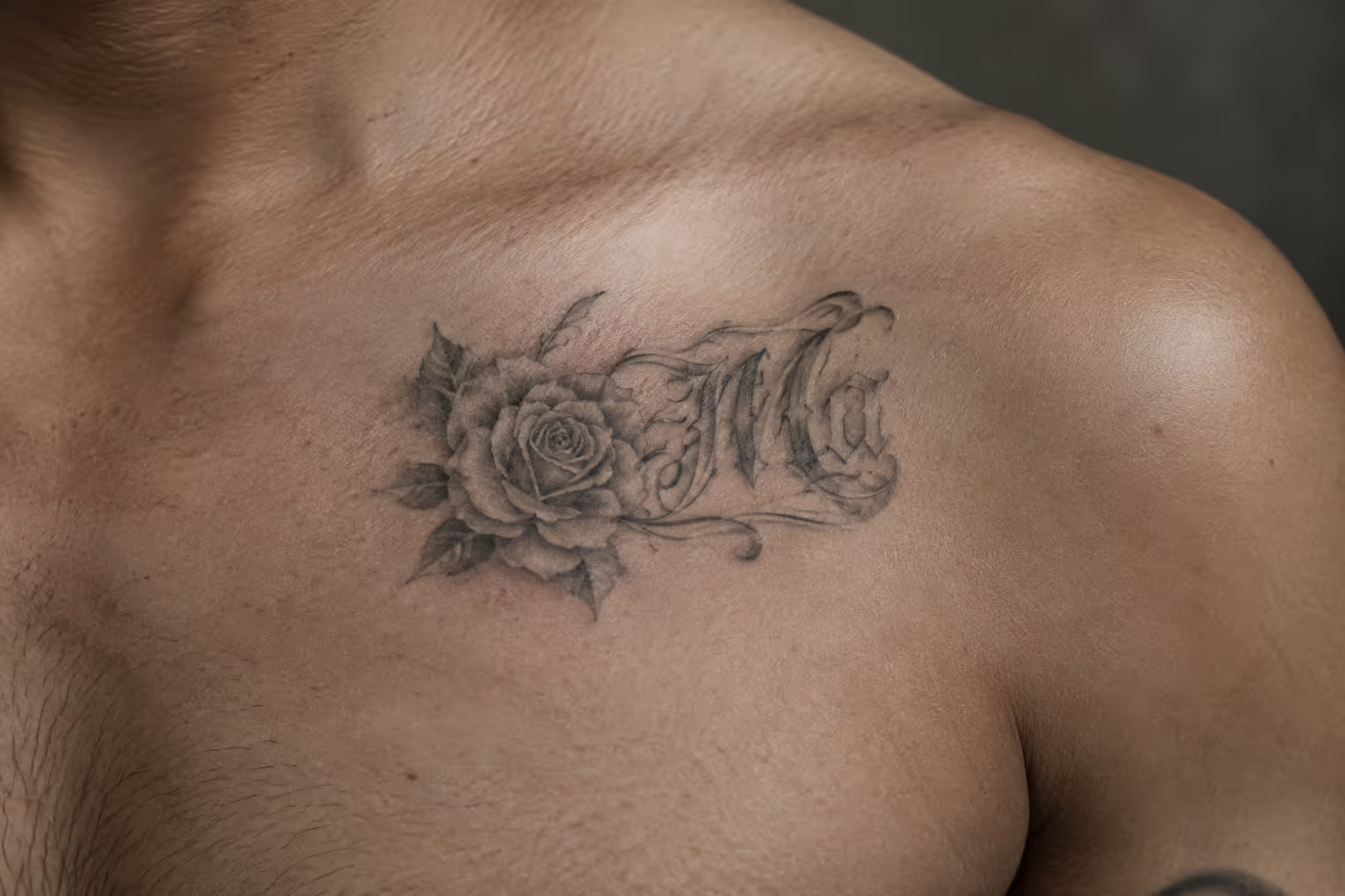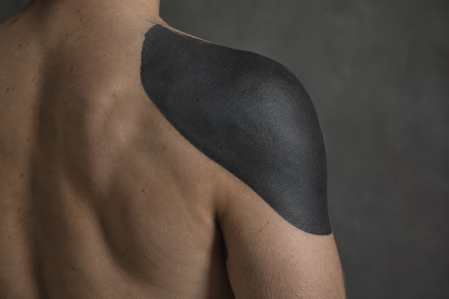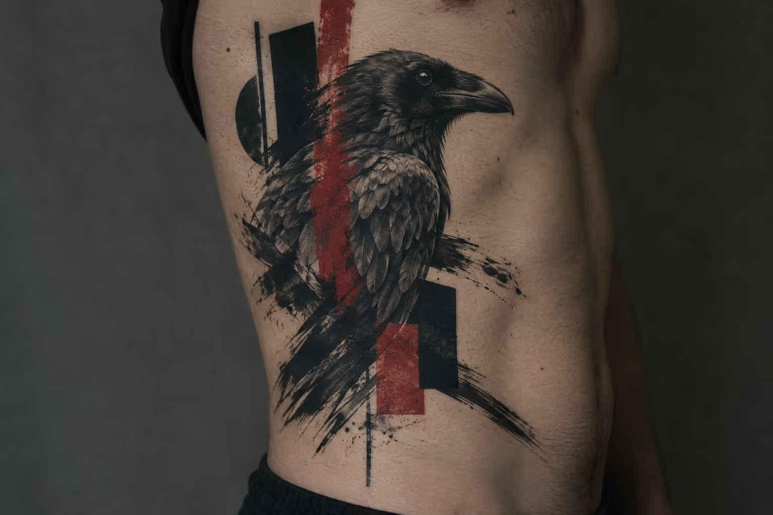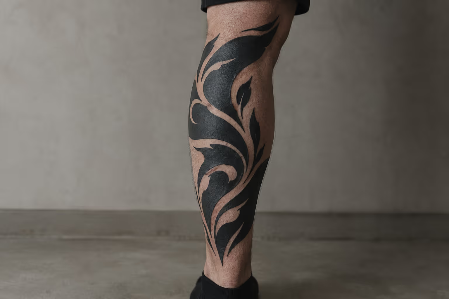
A blackwork tattoo uses black pigment as its entire design language. Solid fills, line weight, pattern and deliberately bare skin do the work that color gradients do in other styles (1). It is not one motif, and it is not the same commitment as a blackout sleeve that buries almost an entire limb in ink. Before you book, you need to know which substyle you want, how it will sit on a curved body, and how much dense black you are willing to live with if your plans change later.
What a Blackwork Tattoo Covers, and What It Doesn’t
A blackwork tattoo is any design built from black ink alone, where contrast comes from solid fills, line weight, pattern and uninked skin rather than blended color (1). The label describes a method, not a subject. A wolf, a mandala, a band of triangles and a Polynesian-inspired shoulder piece can all be blackwork.
The approach is very old. The earliest confirmed human tattoos, about 5,300 years old, are black geometric marks on Ötzi the Iceman (1). The modern revival is more technical, but it follows the same logic: one pigment, and every decision shows.
Two technical hallmarks define good blackwork:
- Even, saturated black fills. Large black areas should heal as one flat, consistent tone, with no grey patches, streaks or “holidays” where the skin shows through by accident.
- Line weight and negative space doing the shading. Depth comes from thick-versus-thin contrast and from planned gaps of bare skin, not from soft grey wash.
The common pitfall when blackwork is done badly is that nothing hides the mistakes. Without color to distract the eye, a misplaced edge, an uneven fill or a badly planned gap is obvious, because contrast carries the whole image hierarchy (1). Patchy fills and crowded spacing are the two flaws you will see most often in weak portfolios.
Geometric, ornamental and illustrative looks
“Blackwork” covers several distinct looks, and you need to name the one you mean (1):
- Geometric: grids, repeating polygons, sacred-geometry lattices, dotwork gradients. Precision and symmetry matter most.
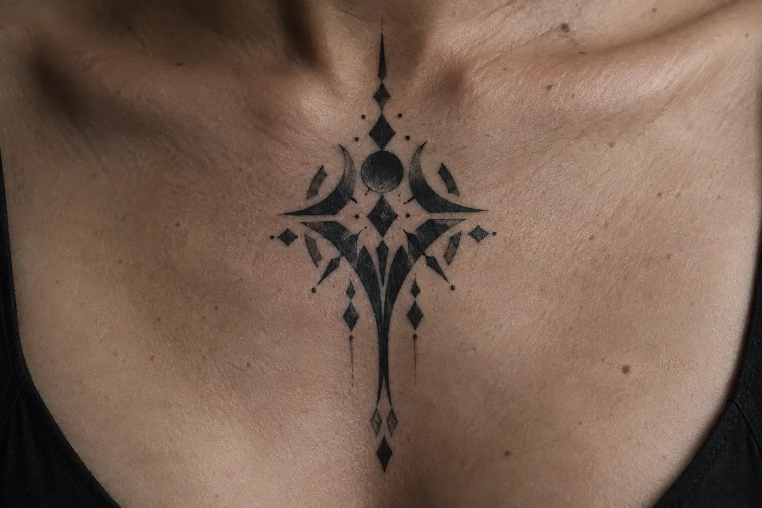
- Ornamental: mandalas, lace patterns, filigree cuffs and jewelry-like framing. Rhythm and spacing matter most.
- Illustrative: recognizable subjects (animals, botanicals, skulls, figures) drawn with bold contours and selective solid fills.
- Tribal and neo-tribal: flowing, body-following black shapes, either drawn from specific cultural traditions or invented in a contemporary idiom.
If you walk in and say “I want blackwork,” one artist will picture a geometric forearm band and another will picture a fully filled sleeve. Bring references for the specific substyle so the conversation starts in the right place (1).
Tribal references vs neo-tribal designs
Traditional tribal tattooing is not a single tradition. Polynesian tatau, Māori tā moko and Bornean (Iban) tattooing each have their own visual vocabulary. In their home cultures, specific motifs can carry lineage, rank, place or rites-of-passage meaning, and some designs are not meant to be worn by outsiders at all. Copying those references casually can strip out that meaning (1).
Neo-tribal work is different. It is a contemporary style that took shape in California in the early 1980s (1). It borrows the bold black flow of tribal forms without reproducing a specific culture’s marks. Its meaning has shifted almost entirely to the aesthetic: it reads as “bold, flowing black shapes,” not as a statement about ancestry.
If you are drawn to a specific tradition, look for an artist who works within it and can explain what the motifs mean. If you just like the shapes, ask for a neo-tribal design and say so plainly.
✓ Pros
- A single black palette keeps the design focused on silhouette and spacing choices.
- The same visual language can scale from a compact motif to a body-spanning composition.
✗ Cons
- Black coverage leaves little room to disguise uneven execution or design choices that do not suit the body.
- A large piece can limit how later work connects across the same area.
What blackwork does well, and where it costs you. On the plus side, it gives strong graphic contrast that reads from across a room. One style covers everything from a small illustrative piece to a full sleeve, and planned negative space keeps detail readable. On the minus side, dense saturation is hard to modify or laser-remove later (1). Large fills mean more sessions and more healing time. Tight spacing can blur into a dark block (1). Skin that gets worked too hard to reach solid black risks scarring and patchiness (1).
Blackwork vs. Blackout: Picking the Right Amount of Black
Blackwork vs blackout comes down to coverage: blackwork mixes imagery, pattern and open-skin negative space, while blackout means near-uniform black over an entire area (1). They are different choices, not synonyms, and the two terms are often confused (1).
A blackwork piece is a composition. Skin breaks, contours and fills share the space. A blackout is a field. Its starting point is coverage, not imagery (1), though it can still use skin breaks as a design element, such as a crisp negative-space band or a cutout pattern inside the black. Blackout is also used for cover-ups, because a solid black field hides almost anything underneath it.
The two need different conversations with your artist:
- For blackwork, you are discussing subject, substyle, line weight, spacing and how the design flows on the limb.
- For blackout, you are discussing where the black starts and stops, how the edges will look, whether any negative-space detail runs through it, how many sessions the fill needs, and whether you understand that this area is effectively closed to future changes.
Pain differs too. A blackout fill usually feels harder to sit through than a patterned piece on the same spot, because the artist passes over every square inch instead of only the lines and selected fills. On any given placement, solid fill > linework.
Before design work starts, describe the effect in plain terms. Something like: “I want a recognizable raven, bold outline, black body with skin highlights on the feathers, and open skin around it.” Or: “I want the forearm solid black from wrist to elbow, with a clean geometric border.” If you are unsure, show one reference you like and one you do not. A “not this” photo removes a lot of ambiguity.
Design Ideas Across Blackwork Substyles
The most useful blackwork tattoo ideas fall into four directions: illustrative subjects with selective fills, geometric grids and polygons, ornamental cuffs and mandalas, and bold silhouettes that use skin breaks as highlights (1). Pick a direction first, then gather three references for it.
Illustrative subjects with bold contours
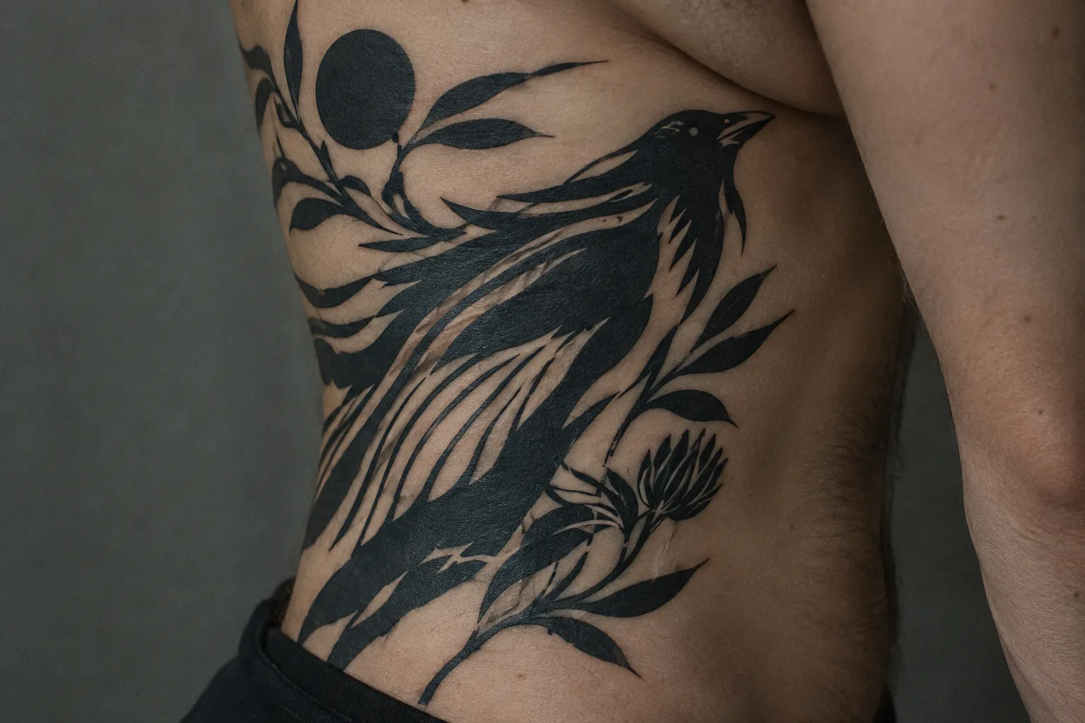
Illustrative blackwork works best with a subject that is recognizable from its outline alone: a crow, a moth, a snake, a peony, a fern frond, a stag skull. Choose bold contours and selective fills, and let the artist reserve strips of bare skin as highlights so the image stays readable without color (1). A black moth with skin-colored vein lines across its wings is the classic example.
Bold silhouettes are the high-contrast version of this idea. The subject is almost entirely solid black, and a few deliberate skin breaks (an eye, a feather edge, a petal line) give it form. They read from a distance and hold up well as the skin ages.
Size it generously, especially if you want interior detail. Shrink a detailed raven too far and the feather breaks close up as the lines soften.
Geometric grids and repeating polygons
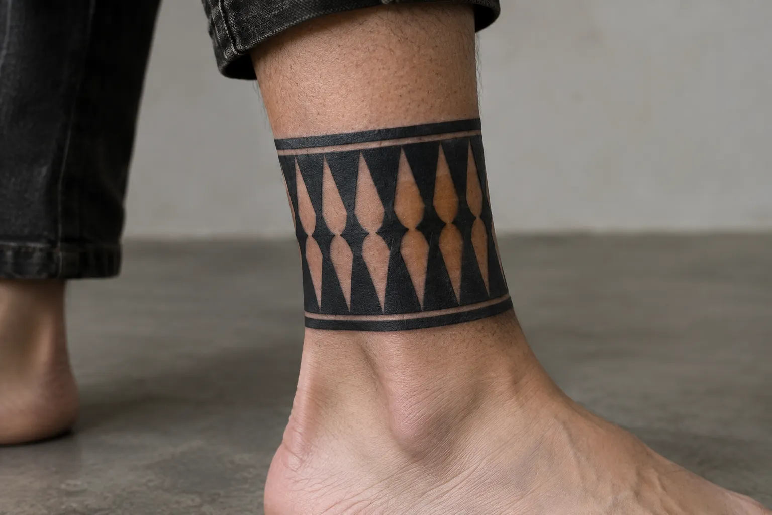
Geometric blackwork relies on repetition, symmetry and deliberate spacing (1). Common directions include:
- triangular or hexagonal grids that fade into dotwork
- concentric circles or nested polygons as a centerpiece
- a geometric band around the forearm or calf
- sacred-geometry lattices (Flower of Life, Metatron’s cube) with solid-filled segments
Straight lines are unforgiving, so ask the artist to check how lines and gaps behave when the design wraps a limb or crosses a joint (1). A wraparound band needs enough height that the internal shapes do not crowd.
Ornamental cuffs and mandalas
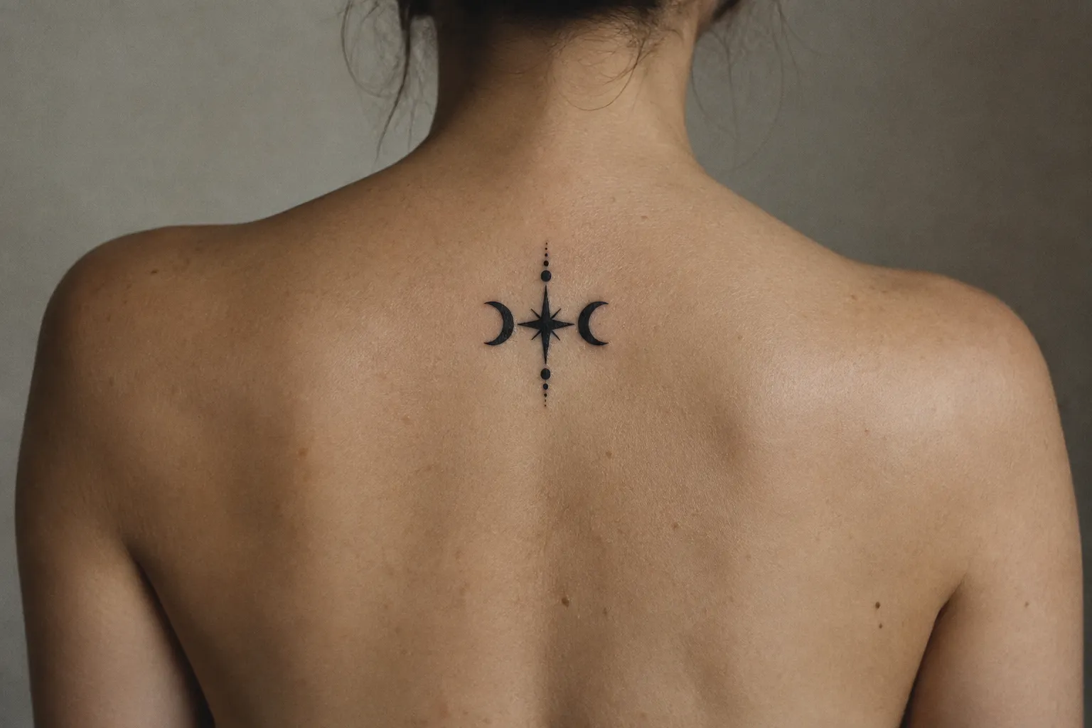
Ornamental work draws on lace-like patterning, filigree and mandala-inspired structures, often set as cuffs or frames (1). Its appeal is the rhythm of repeated small elements, which depends on keeping enough open skin between them.
Small ornamental lace needs simpler patterns with fewer, larger openings.
How the four substyles compare. Geometric work is defined by straight lines, symmetry and repetition. It typically sits on forearms, upper arms, chest, back or knees (1), uses negative space as regular channels between shapes, and needs moderate session time with high precision. Ornamental work is defined by repeated decorative motifs and framing. It typically sits on the sternum, back, thighs, ribs or forearms (1), relies on negative space for its lace-like openness, and runs from moderate to long depending on density. Illustrative work is defined by bold contours plus selective fills on a recognizable subject. It suits larger surfaces such as thighs and upper arms (1), uses negative space as highlights inside the image, and usually takes moderate time. Tribal and neo-tribal work is defined by flowing black shapes that follow muscle lines. It suits shoulders, upper arms and calves (1), uses negative space as the gaps between flowing forms, and ranges from moderate to long, since large black areas add time.
Where Each Substyle Looks Best on the Body
Blackwork placement should follow both the substyle and the body’s geometry. Flowing tribal or neo-tribal forms suit shoulders, upper arms and calves. Ornamental framing suits the sternum, back, thighs, ribs or forearms. Illustrative pieces suit larger surfaces like thighs or upper arms (1). These are design suggestions, not rules, but they reflect where each look has room to work.
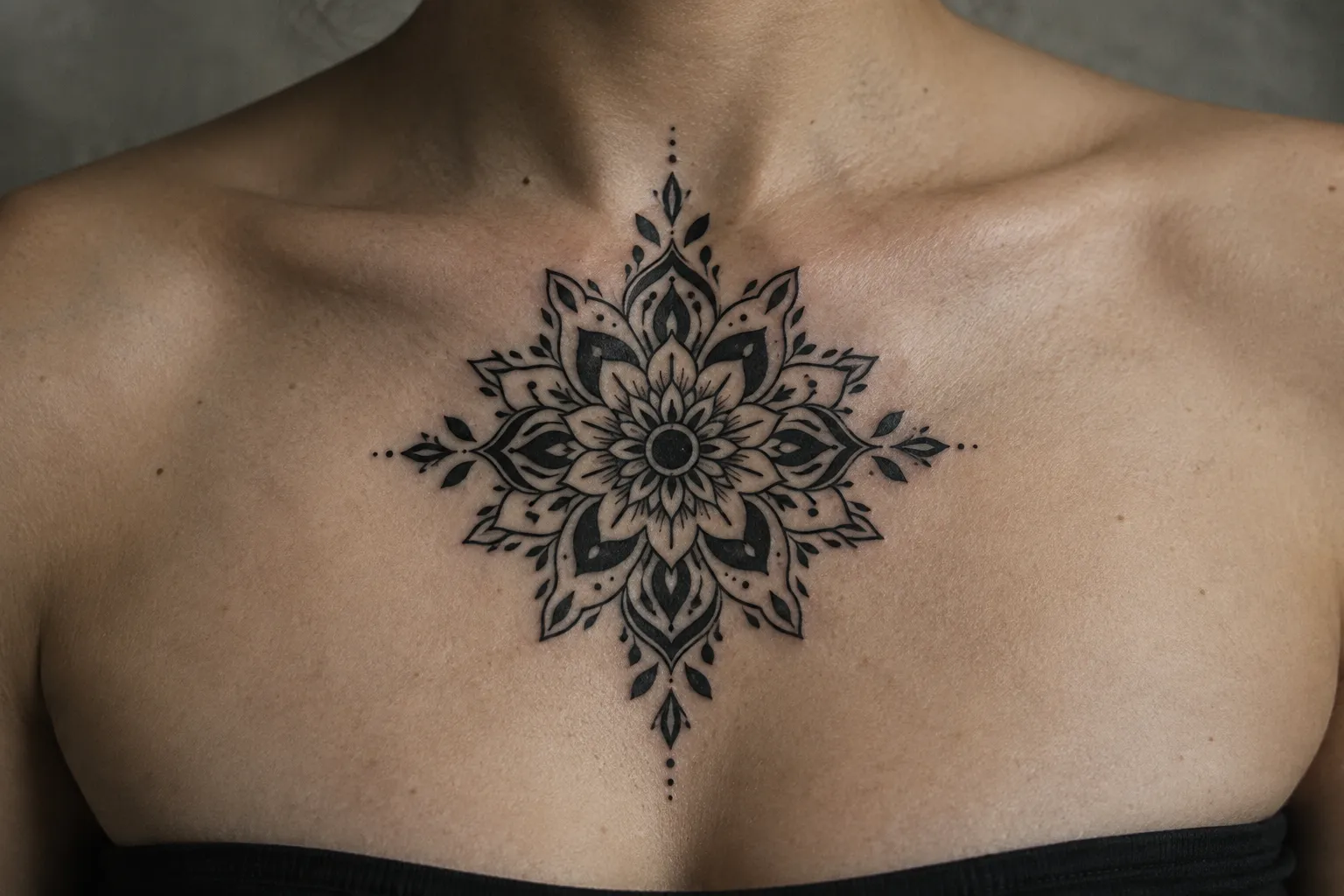
One caveat applies everywhere: a design that looks balanced on paper may need reworking once it crosses a joint or wraps a limb (1). Ask the artist to show you the composition on your body, through a stencil, a drawn-on mockup or a photo overlay, not just as a flat drawing (1).
On a typical tattoo pain scale, the sternum and ribs sit near the top, while the outer upper arm, outer thigh, calves and outer forearm sit near the bottom. Bony, thin-skinned areas hurt more than padded, muscular ones, and solid fill makes any spot harder to sit through than linework.
Flowing tribal and neo-tribal placements
Tribal and neo-tribal shapes are designed to follow muscle. The deltoid cap, the curve from shoulder to upper arm and the length of the calf give the black forms a direction to move in (1). A calf wrap needs most of the length between knee and ankle to flow properly. Placing these designs flat in the middle of a back, with no muscle line to follow, often makes them look stiff.
Ornamental framing zones
Ornamental work loves symmetry and a natural centerline, which is why the sternum, the spine and the ribs are common choices (1). Forearms take cuffs and vertical ornamental drops well. Thighs give a mandala room to spread.
Watch the sternum and ribs for movement. Breathing and posture shift the skin, so check symmetry standing up, not lying on the table. A mandala centered while you are reclined can sit visibly off-center once you stand.
Illustrative work on larger surfaces
Illustrative blackwork needs flat-ish, uninterrupted space so the subject reads in one glance. Thighs, upper arms, forearms and calves all work (1), with the outer thigh and outer upper arm giving the most uninterrupted space. Avoid putting the focal point, such as an eye or a face, directly over the elbow or knee crease, where flexing distorts it. If the subject has to wrap, place the focal point on the flattest part and let tails, leaves or wings take the curve.
Why Negative Space Makes or Breaks the Design
Negative space in blackwork is deliberately uninked skin used to separate shapes, create highlights and keep dense patterns readable. It is part of the composition, not blank space left over (1). In a style with one pigment, the skin is effectively your second color.
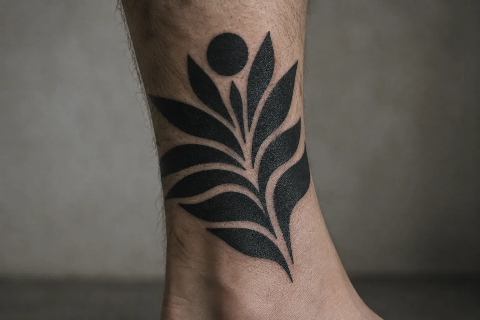
Negative space does three jobs:
- Separation: a channel of bare skin tells your eye where one shape ends and the next begins.
- Highlights: skin breaks inside a black fill suggest light hitting a surface, which is how a solid-black animal gets dimension.
- Readability over time: it keeps detailed areas from merging into each other.
That last job matters because tattoo lines soften and spread a little as the years pass. Tight ornamental spacing can lose its lace-like look and read as a single dark block once that happens (1). Fresh, the piece looks delicate. Ten years later, the openings between the petals have closed and you have a smudge where a mandala used to be.
A practical rule of thumb: the smaller and denser the pattern, the wider the skin gaps need to be relative to the lines around them. On fine ornamental work, any gap that looks barely visible on the stencil is a gap that will likely close. Bold geometric channels survive. Hairline gaps between heavy fills usually do not, especially on hands, feet and inner wrists, where skin moves and regenerates more.
Ask the artist to plan the gaps before the outline goes down (1). Two questions help:
- “Which areas are meant to stay open skin, and how wide will those channels be?”
- “How will this spacing look in five or ten years?”
An experienced blackwork artist will have a direct answer, often with healed photos to show it. If the answer is vague, the spacing probably has not been planned yet.
Planning a Blackwork Sleeve
A blackwork sleeve works best when density, spacing and room for future extensions are decided at the planning stage, before any ink goes down (1). A sleeve is one composition spread across a cylinder that bends at the elbow and twists at the forearm, so it cannot be planned as a single flat drawing.
Breaking the arm into balanced thirds
The “1/3 rule” comes up constantly in sleeve planning, and it has more than one meaning depending on who uses it. The most common version borrows from the photographer’s rule of thirds: divide the space into thirds and place your main elements on those divisions instead of dead center. That gives a composition movement and stops it from feeling static. A second version is a proportion guide: no single element should take more than about a third of the area, and roughly a third should stay lighter or open so the dense parts have room to read.
On a sleeve, both versions point the same way. Treat the arm as three zones:
- Upper arm and shoulder: the largest, flattest canvas, and the best home for your main illustrative subject or a large ornamental centerpiece.
- Elbow: a transition zone. Use pattern, filler geometry or a solid band here rather than a focal image, since the joint distorts anything detailed.
- Forearm: the most visible section. A secondary subject, a geometric field or an ornamental cuff at the wrist anchors it.
Check balance in three dimensions. A front-facing composition can look complete while the inner arm and back of the arm are an afterthought. Ask the artist to show how the design reads from the front, the side and with the arm raised. Geometric work especially needs a check where it wraps: a grid that is square on paper may skew across the forearm’s twist.
Planning sessions for a sleeve that may grow
Decide density and spacing before the first session (1). A patterned sleeve with open skin and a mostly filled sleeve take different amounts of time and leave different options open afterward. If you are unsure, start lighter. Adding black later is straightforward. Taking it away is not.
If you think the sleeve may extend onto the chest, shoulder blade or hand, say so at the start (1). The artist can end the shoulder with an open edge or a pattern that continues naturally, instead of a hard border you will later have to break. The same goes for a half sleeve that might become a full one: leave the forearm transition designed to continue.
There is no fixed schedule for how many sessions a blackwork sleeve takes. The count depends on the design and how your skin responds (1). Large fill areas may need breaks within a sitting, or a split across more than one (1).
Choosing an Artist: Healed Portfolios and Studio Hygiene
Choosing a blackwork artist means running two checks together: reviewing healed portfolio photos for even black coverage and legible negative space, and confirming the studio uses single-use needles and proper sterilization (1). Most people do one or the other. You need both, because a great design from a careless studio and a safe studio with patchy fills both end badly.
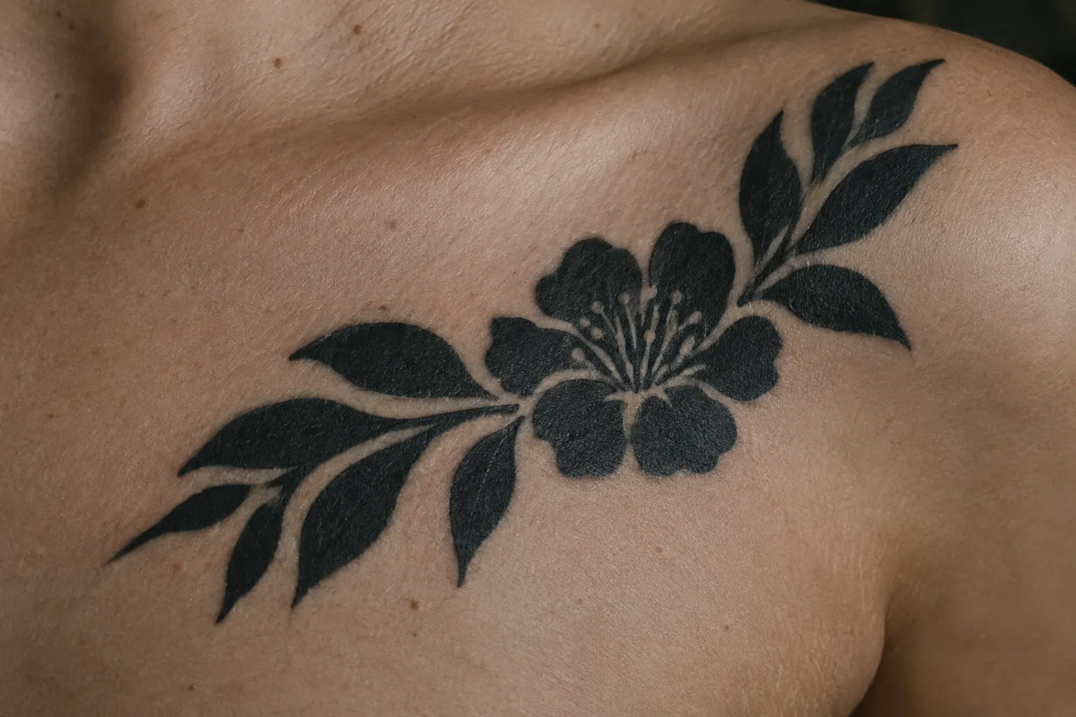
What to look for in healed portfolio photos
Fresh tattoo photos flatter everything: the black is glossy, the skin is red so contrast pops, and spacing has not settled yet. Ask specifically for healed work (1). Then look at:
- Black fields: do they look even and solid, or patchy, grey-streaked or mottled (1)?
- Edges: are borders between black and skin crisp, or fuzzy and spread (1)?
- Negative-space channels: do the open-skin gaps still separate forms clearly, or have they started to close (1)?
- Line work in geometric pieces: are straight lines straight and symmetric pieces symmetric on the body, not just on the stencil?
- Large fills: ask how the artist handles them, including pacing, pass count and how they split work across sessions (1).
Blackwork is often named among the hardest styles to do well for exactly these reasons. Realism and fine-line work get the reputation, but a large, perfectly even black fill and a geometric piece that stays symmetric around a limb are both technically demanding. Healed photos are where an artist’s skill shows.
Hygiene questions worth asking before booking
Check studio hygiene and ask directly about single-use needles, sterilization of reusable equipment and the studio’s local licensing (1). A reputable studio answers without hesitation and opens needle cartridges in front of you.
The FDA notes that unsterile equipment and contaminated ink can cause infections (2). According to the FDA, even unopened, sealed tattoo inks can harbor bacteria and other microorganisms (2). It is reasonable to ask which ink brand the studio uses. If you later suspect an infection, the FDA advises contacting a healthcare professional and asking the studio for the ink brand and lot information (2).
Also tell your artist about any medications you take, especially blood thinners, and do not stop a prescribed medication without asking your doctor.
Healing Timeline and Aftercare for Dense Black Work
Most tattoos look healed on the surface around weeks 3-4 and settle fully around week 6. Large, heavily saturated black areas often feel tender longer and peel more visibly than linework, so wait the full six weeks before you judge the result. The basic aftercare routine is to wash gently with soap and water twice a day, pat the area dry instead of rubbing, keep it out of the sun and skip swimming until it heals.
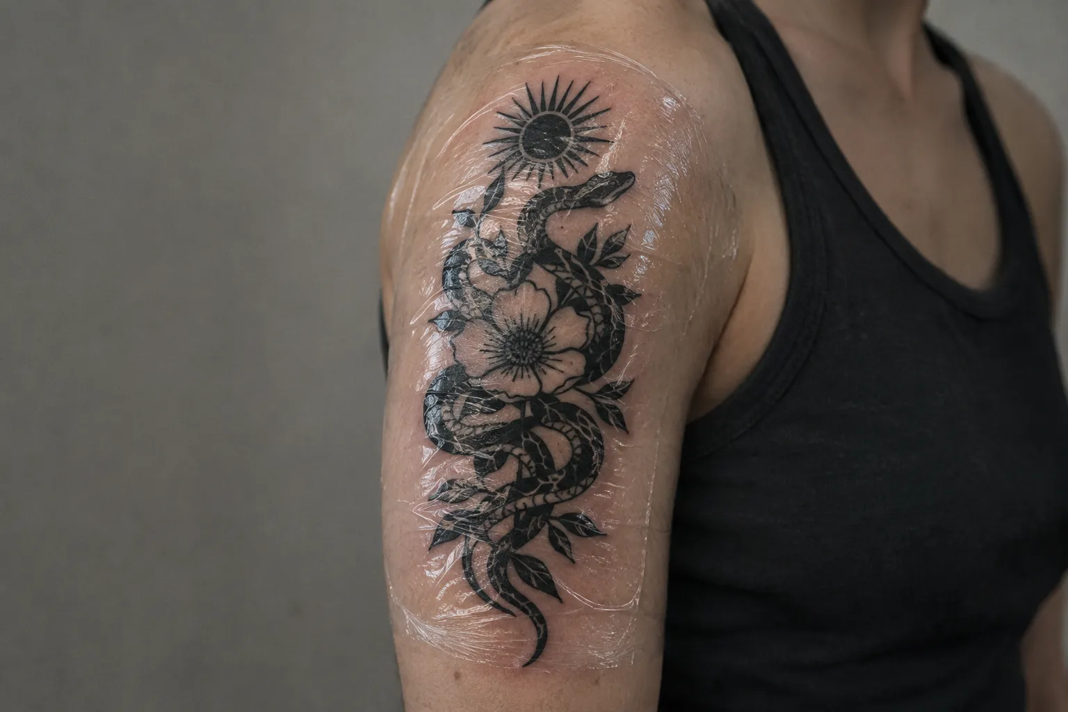
Days 1-3
- Leave the initial wrap or film on for as long as your artist instructs.
- Wash gently twice a day with lukewarm water and a mild, fragrance-free soap, using clean hands rather than a washcloth.
- Pat dry with a clean paper towel. Do not rub.
- Expect swelling, warmth and some weeping of plasma and ink. Dense fills weep more than outlines.
- Apply a thin layer of fragrance-free moisturizer or the aftercare ointment your artist recommends. A thin layer only: a heavy coat traps moisture and can soften the fresh skin.
- Wear loose clothing over the area. Tight sleeves or waistbands rubbing a fresh fill can pull ink out.
Week 1
- Flaking starts, usually around day 4-7. On solid black areas it can look dramatic, with dark flakes coming away. That is normal: you are shedding surface skin, not losing the tattoo.
- Itching builds toward week 2. Slap lightly or apply a cool compress instead of scratching.
- Do not pick flakes or scabs. Pulling them early can lift pigment and leave pale spots in a fill.
- No swimming pools, hot tubs, baths or the sea. Showers are fine.
- Keep the tattoo out of direct sun.
Weeks 2-4
- Week 2 is the main peeling and itching stretch. Once the flakes are gone, the black may look slightly cloudy or milky. That is a new layer of skin settling over the ink, and it usually clears by weeks 3-4.
- Keep moisturizing once or twice a day while the skin still feels tight or dry.
- Keep it out of direct sun for the first 4-6 weeks. Once fully healed, protect the tattoo with sun-protective clothing or a high-SPF sunscreen. UV exposure is the main reason black fades to grey-green over the years.
- Flag a problem if you see spreading redness, increasing pain, pus, raised bumps or a fever, or if the tattoo simply is not healing. The FDA advises contacting a healthcare professional if redness or bumps develop or healing stalls (2).
- Around week 6, once the skin has settled, look at the healed result in daylight. Small patchy spots in solid fills are common and are usually fixed at a touch-up session. Ask your artist when they want to see you.
Session Planning, Cover-Ups and Future Flexibility
Patterned blackwork with negative space keeps far more future options open than a dense blackout fill. If you might want to modify, add to or remove the tattoo later, start with pattern and open skin rather than solid black (1). Heavy black is the most permanent decision in tattooing, and it is worth deciding on purpose.
Blackout and cover-ups: what gets harder to change
Dense black limits what can come next (1). Over a solid field, the realistic options are limited to white or light-color detail on top (which tends to fade or turn muddy as it heals into black), extending the black further, or laser lightening first.
Laser removal is the other half of this, and the news is better than most clients expect: dark blue and black are actually the easiest tattoo-ink colors for a laser to break down, easier than green, red or yellow (4). That does not mean one session does it. A large blackout still needs many sessions to lighten, and complete removal is not guaranteed even with the easiest color on the chart (4). A patterned piece with plenty of open skin lightens more evenly and gives a future cover-up artist more to work with.
This matters most with cover-ups. Blacking out an old tattoo works, but discuss future flexibility before committing (1). Sometimes a heavier blackwork design, such as a bold illustrative piece or a dense ornamental pattern placed over the old ink, hides the old tattoo just as well and leaves you more options later.
How session count gets decided
There is no standard session schedule for large blackwork or blackout. Session count depends on design size and how your skin responds (1). A full blackout sleeve is rarely a single sitting.
The real limit is the skin. Repeatedly working already irritated skin, or using too much pressure to force saturation, overworks the tissue and risks scarring, patchiness and blowouts (1). A good artist will stop a session when the skin is no longer taking ink cleanly, even if the plan said to finish the fill. That is not a lack of stamina. It is how you get an even black that heals well. Ask up front whether large areas will be split across appointments (1), and do not push to compress the schedule.
Frequently Asked Questions
- What does blackwork mean in tattoos?
- It's a catch-all term for the ink, not the subject matter: a wolf, a mandala or a tribal band can all qualify as long as black pigment alone carries the design. Ask your artist which substyle they mean before you commit to references.
- Is blackout tattoo racist?
- Blackout is a coverage technique, not a cultural identity; concerns arise when people copy specific cultural motifs without permission or understanding. Ask an artist from that tradition about its designs.
- What is the 1/3 rule tattoo?
- The 1/3 rule is a flexible composition guide for distributing focal elements and open areas, not a tattooing standard. Ask your artist which interpretation they are using for your piece.
- What is the hardest style to tattoo?
- There is no universally hardest tattoo style; blackwork is demanding when solid fills must heal evenly or geometry must stay balanced around a moving limb.
- How long does a blackwork tattoo take to heal?
- Linework closes up fastest; it's the heavy solid fills that stay tender, peel harder and look cloudy the longest. Judge the final result once the skin has fully settled, not right after the surface peeling stops.
- How can I tell if a studio follows safe hygiene practices?
- Look for sealed, single-use needles opened at your station, clear answers about sterilizing reusable tools, and compliance with local licensing rules. Ask for the ink brand and lot details if a problem develops.
Deciding How Much Black to Commit To
Blackwork and blackout answer different questions. Blackwork is about pattern, imagery and negative space. Blackout is about near-uniform coverage. Settle which one you want before the design stage, then work through the practical decisions in order:
- Substyle: geometric, ornamental, illustrative or tribal/neo-tribal, with three references.
- Placement: tribal flow on shoulders, upper arms and calves; ornamental framing on the sternum, back, ribs, thighs or forearms; illustrative work on larger, flatter surfaces. Check the stencil on your body, especially over joints.
- Spacing: have the open-skin channels planned before the outline goes down, wide enough to stay open in ten years.
- Artist: healed photos with even black and legible gaps, plus single-use needles and sterilization you have confirmed.
- Aftercare: gentle washing twice a day, no picking, no swimming for about three weeks, no direct sun for four to six weeks, then sun protection for life.
- Flexibility: if there is any chance you will want to change it, choose patterned blackwork over a dense fill. Black is easy to add and hard to take away.