The thing that keeps a chrysanthemum tattoo readable at ten years isn’t more detail - it’s less. All those packed petals blur into a dark blob if the artist crams them; deliberate spacing is what holds the shape as the ink spreads over time. The meaning matters too and swings hard by tradition. Here’s how Japanese, fine-line, and realism styles handle both the symbolism and the aging.
Chrysanthemum Tattoo Meaning: Symbolism Across Cultures
The chrysanthemum carries different meanings depending on which tradition you reference, and you should know which one you’re invoking before you commit.
In Japanese tattoo symbolism, the chrysanthemum - kiku - is tied to the Imperial Family and reads as a flower of beauty, longevity, and royalty (2). It also has a protective role: Tattoo Life notes the flower was historically used as a talisman to ward off evil spirits, particularly among people in dangerous trades like firemen (2). So in a Japanese context, you’re not just wearing a pretty flower - you’re wearing a symbol with nobility and protection baked into it.
Western floral tradition reads the same flower more softly. Here the chrysanthemum tends to mean joy, optimism, and remembrance, with less of the imperial weight (1)(6). It’s also a common November birth flower reference.
This split matters. Treating “chrysanthemum meaning” as universal is one of the most common mistakes I see clients make when they come in with reference images. If you want royalty and longevity, you’re working in the Japanese register. If you want joy or memorial meaning, you’re in the Western one. The design choices follow from that decision - bold outlines and wind bars point Japanese; softer color and botanical detail point Western.
Color shifts the reading too:
- White chrysanthemums lean toward purity, honor, and grief - often chosen for memorial pieces.
- Red reads as love or passion.
- Yellow carries happiness, friendship, and in some traditions, slighted or unrequited love.
Pick your cultural frame and your color before you sit down with an artist. Those two choices drive everything else.
✓ Pros
- Rich cultural symbolism with distinct Japanese and Western meanings
- Works in multiple styles from fine-line to bold Japanese panels
- Clear guidelines on placement and size for longevity
✗ Cons
- Over-detailing in small sizes causes blurring over time
- Color fades quickly without dark contour anchoring
- Misunderstanding cultural symbolism can dilute intended meaning
Japanese Chrysanthemum Tattoo: The Imperial Bloom
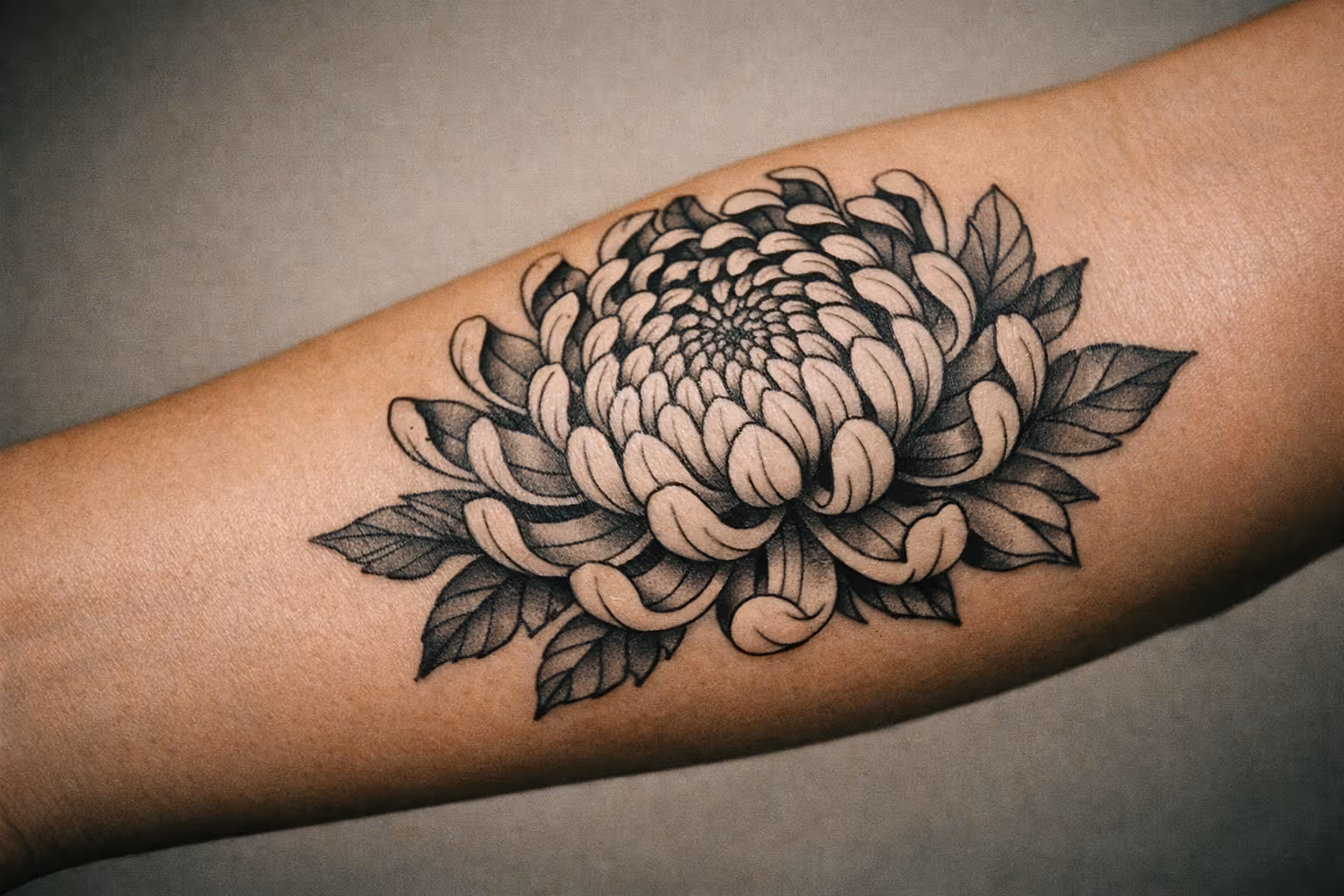
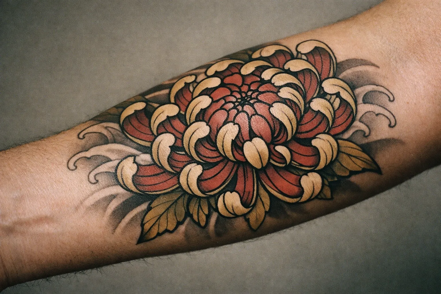
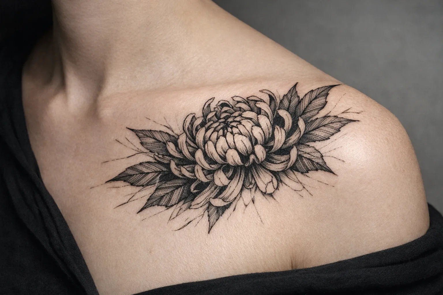
A Japanese chrysanthemum tattoo sits alongside dragons, koi, and waves as one of the cornerstone motifs of irezumi. The technical hallmarks are a dark outer contour with lighter inner petal transitions, and integration into a larger composition rather than floating in isolation. In traditional Japanese work, the chrysanthemum often functions as a focal point, a frame, or background filler woven between wind bars and water (2).
That last point is worth dwelling on. The chrysanthemum rarely stands alone in true Japanese-style work - it breathes within the larger scene. The outer arm, thigh, or calf are the right placements because they offer enough flat surface for the petals to read and enough length for the flower to interact with surrounding elements.
For sizing, a single Japanese-style chrysanthemum panel works at roughly 5-8 inches (13-20 cm) as a standalone piece on the upper arm. As part of a sleeve, it becomes one node in a composition that wraps the whole limb. Either way, this is bold, saturated work - not delicate line art.
Pain note: outer thigh and outer arm are on the more tolerable end. If a chrysanthemum wraps toward the inner arm or ribs, expect that to climb - inner bicep and ribcage outrank the outer arm by a wide margin.
A common pitfall when artists do Japanese flowers badly: cramming too much petal texture into a small space so the radial structure muddies as it heals. Good Japanese tattooers prioritize clean petal separation and strong contrast over microscopic detail. I’ve seen beautiful reference images turn into dark, indistinct blobs at the three-year mark because the artist tried to fit too much interior texture into a 4-inch space. The petals need room to exist as individual shapes, not just as suggestion.
Styles That Work for This Bloom
The chrysanthemum flower tattoo adapts to several distinct styles, and the right one depends on your placement, budget, and how much detail you want surviving the next ten years.
Fine-line chrysanthemum. Line-work-only versions are currently common and translate well to smaller placements - wrist, forearm, ankle, or shoulder (4). This is a solid choice for a first tattoo. Keep the bloom open and the linework confident; thin scratchy lines on a tight cluster of petals are the version that blows out over time. Size range: 2-4 inches (5-10 cm). The technical hallmarks here are a single consistent line weight throughout and deliberate negative space between petals - without both, the bloom reads as a scribble rather than a flower. The common pitfall is artists who taper their lines too aggressively on the inner petal structure, leaving hairline marks that spread and merge within two years.
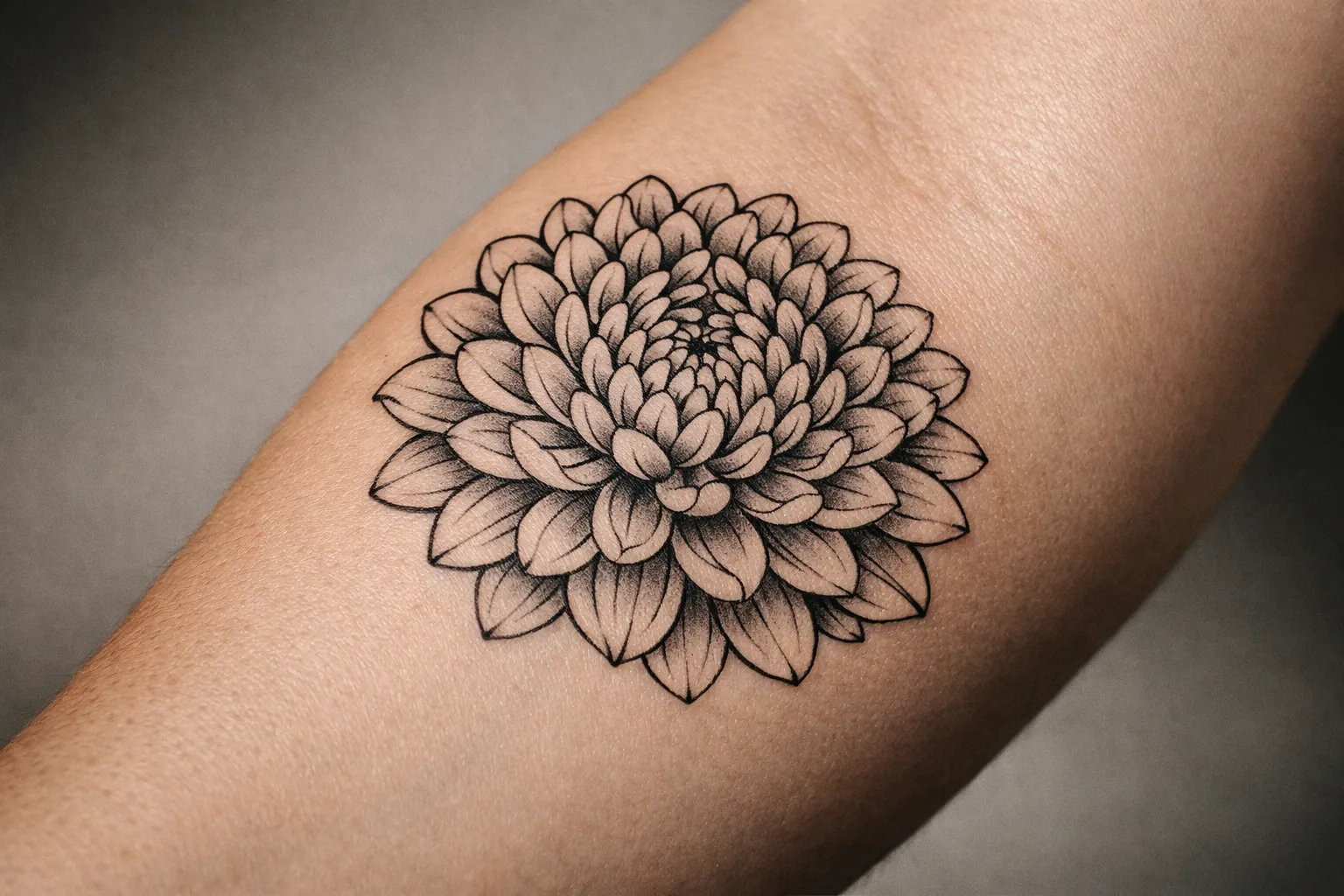
Botanical realism. This is the texture-heavy, color-layered option. It needs surface area to preserve petal detail, so think upper arm, thigh, or shoulder blade at 4-6 inches (10-15 cm) minimum. Realism demands more time and usually more than one session for the color packing. A well-executed botanical chrysanthemum uses layered color passes - typically three or more - to build the gradient from the darker petal base to the lighter tip. That layering is what separates a realism piece that holds up from one that looks flat after the first year of sun exposure.
Black-and-grey chrysanthemum. A black and grey chrysanthemum tattoo is the most reliable for aging. Darker contrast ages more predictably than pale color gradients, so if longevity is your priority over vivid color, this is the route. It also reads cleanly on a wide range of skin tones because you’re relying on value contrast rather than hue.
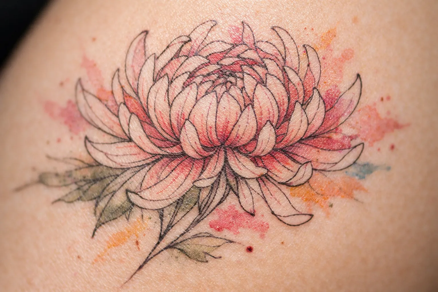
Watercolor and soft-color. Pretty, but be honest about the trade-off. Light yellow, pale orange, and pastel petals are the first things to wash out. If you want color, ask your artist to anchor it with a dark contour so the flower keeps its shape as the lighter tones soften.
Whatever style you choose, ask for the stencil at the exact final size before you commit. A chrysanthemum’s symmetry can look balanced on a screen and distort once it’s wrapped around a curved surface.
Placement and Size: Matching the Bloom to the Body
The chrysanthemum’s radial structure rewards flat or gently curved surfaces and fights tight, narrow ones.
- Upper arm and thigh give the best canvas for petal density. This is where layered, detailed blooms read best.
- Forearm works well for a single medium flower, roughly 3-5 inches (8-13 cm), and you get to watch it move with your arm.
- Ribs and wrist require simplified shapes. The flower’s symmetry distorts on narrow or sharply curved surfaces, so go simpler and larger-shaped rather than packing detail.
- Behind the ear or ankle can hold a small single bloom, but keep it to a clean outline - detail at that scale closes up fast.
A practical rule: the more petals you want clearly separated, the more space you need. A simplified five-petal stylized bloom survives at 2 inches. A realistic forty-petal chrysanthemum at 2 inches becomes a dark smudge within a few years.
When clients show me reference images on their phones, the first thing I ask is where they’re planning to put it. The placement question isn’t secondary - it determines what version of the design is even possible. A forty-petal chrysanthemum that looks striking on the upper arm becomes a structural problem on the inner wrist, where the skin is thin, the surface curves sharply, and the lines spread faster than almost anywhere else on the body. The inner wrist also ranks higher on the pain scale than the outer forearm - not the worst placement, but noticeably sharper than the outer arm or thigh. If you’re set on a wrist piece, simplify the petal count and go bolder on the outline so the shape survives the spread.
How Big Should a $500 Tattoo Be? Budget and Size Benchmarks
This is where most chrysanthemum guides go quiet, so here are real anchors.
A $500 budget typically buys a small-to-medium chrysanthemum - think a single fine-line or simple black-and-grey bloom in the 2-4 inch (5-10 cm) range, usually completed in one session. A clean line-work chrysanthemum on the forearm or shoulder fits comfortably in this bracket. You’re not getting a full color sleeve panel for this; you’re getting one well-executed flower.
A $3,000 budget moves you into large, multi-session territory. That’s a chrysanthemum sleeve segment, a back piece, or a custom multi-flower composition with background elements - Japanese-style work with waves or wind bars sits here. Expect the artist to split this across two or more appointments to preserve line quality and manage swelling.
To control budget without gutting the design: keep the bloom large but limit background elements. A big, clean chrysanthemum with minimal surrounding detail preserves the flower’s identity while lowering session count and cost. The petals are where the time goes - every layered petal is more line and shading work than a simple single-stem floral outline, which is the cost factor most clients underestimate.
What Designs to Avoid
Not every version of this flower ages well, and a few choices are worth steering away from.
- Over-detailed blooms in small spaces. The single biggest failure mode. Pack forty petals of interior texture into a 2-inch wrist piece and the inner structure blurs into a dark mass within a few years. Closed interior shapes blur faster than open, spaced petals.
- Pale color with no contrast anchor. Very light yellow, pale orange, or pastel petals without a dark outline wash out visually. If you want soft color, demand a contour to hold the shape.
- Stock-image lifts. Shutterstock alone lists 4,451 chrysanthemum tattoo assets (3). Pulling a design straight off a stock library produces generic work that thousands of others are also wearing. Use references for direction, then customize.
- Random Japanese pairings. The chrysanthemum already carries specific symbolism in Japanese tradition - royalty, longevity, protection (2). Bolting it onto unrelated Japanese motifs without checking cultural coherence weakens the intended message. If you’re going Japanese, the elements should talk to each other.
- Cramped placement. Forcing a radial flower into a tight, sharply curved patch distorts the symmetry. Give it a surface that lets the bloom stay round.
The general principle: prioritize spacing between petals over microscopic petal texture. That single choice does more for how a chrysanthemum tattoo ages than almost anything else. It also makes the design more readable at a distance, which is how most people will actually see it - not up close under studio lighting, but across a room or in motion. A chrysanthemum with five clearly separated, well-defined petals reads as a chrysanthemum from ten feet away. One with forty tightly packed petals reads as a dark circle.
What Makes a Chrysanthemum Composition Read Well
A chrysanthemum tattoo succeeds or fails on readability - whether the eye still resolves it as a chrysanthemum after the skin has done its thing over a decade.
Three things drive that:
- A dark outer contour. The strong outer boundary is what holds the radial shape together as everything inside softens. Ask for it.
- Lighter inner petal transitions. Build value from dark contour to lighter center so the petals layer and overlap convincingly without each one needing its own heavy line.
- Breathing room in the composition. Whether it’s a standalone piece or part of a sleeve, the flower needs space around it. Japanese work treats the chrysanthemum as one element interacting with waves or wind - not a flower crammed into a gap (2).
When you’re looking at reference images and trying to figure out why one chrysanthemum tattoo looks better than another, it usually comes down to these three things. The good ones have a clear shape, contrast that pulls the petals apart, and enough space to actually see the flower. The forgettable ones are over-packed, low-contrast, and squeezed into too little real estate.
For different skin tones, lean harder on value contrast than on subtle hue. A black-and-grey or strongly contoured chrysanthemum reads cleanly across a wide range of skin because it relies on light-and-dark structure rather than delicate color you can’t fully see once it’s healed. On deeper skin tones specifically, pale yellow and pastel orange petals can disappear almost entirely after healing - the pigment sits under a layer of skin that absorbs and diffuses light differently. The fix is the same as for aging: anchor the design with a strong dark contour and use saturated mid-tones rather than pastels for the petal fill. Black-and-grey with white highlights is often the most reliable option for clients with deeper complexions who want visible petal definition long-term.
Aftercare for Chrysanthemums
Aftercare matters more on dense-shaded chrysanthemums because petal gradients can blur if the heal goes badly. Here’s the timeline.
Day 1-3: Keep the wrapped bandage on as long as your artist directs, usually a few hours. After removal, wash gently with lukewarm water and a fragrance-free soap, pat dry, and apply a thin layer of fragrance-free moisturizer. The tattoo will weep plasma and ink - normal. Don’t over-apply ointment; a thin coat lets the skin breathe.
Week 1: Expect flaking and light scabbing, especially over the densely shaded petal centers. Do not pick or scratch - pulling a scab off a packed-color petal is how you get patchy gradients. Keep moisturizing lightly, two to three times a day.
Week 2-4: The surface heals over but the deeper layers are still settling. The tattoo may look dull or “milky” as new skin forms over the color - this clears as it finishes. Keep it out of direct sun and pools.
Once healed, the long game for any color chrysanthemum is sun protection. UV is what fades those yellow and red petals fastest, so use sun-protective clothing or a high-SPF sunscreen over the piece whenever it’s exposed. A black-and-grey chrysanthemum is more forgiving here, but it still benefits from the same habit. Beyond sun protection, the other factor most clients overlook is moisturizing consistently through months two and three, not just the first two weeks. Healed skin that stays hydrated holds ink more evenly than dry skin that flakes and pulls at the surface layer. A fragrance-free moisturizer applied daily - not just when the tattoo feels tight - makes a measurable difference in how the petal gradients look at the one-year mark compared to how they looked the day the bandage came off.
Frequently Asked Questions
- What does the chrysanthemum tattoo mean?
- The meaning varies by tradition: Japanese tattoos symbolize royalty, longevity, and protection linked to the Imperial Family and talismanic use, while Western tradition leans toward joy, optimism, and remembrance. Color choices further shift meaning, so clarify your cultural frame before commissioning.
- How big is a $3,000 tattoo?
- A $3,000 budget typically covers a large, multi-session chrysanthemum piece like a sleeve segment or back panel with background elements, often split into two or more appointments to maintain line quality and manage swelling.
- How big should a $500 tattoo be?
- Around $500 usually gets a small-to-medium chrysanthemum tattoo, about 2-4 inches, done in a single session. This is enough for a fine-line or simple black-and-grey bloom on forearm, shoulder, or calf, but not for a full color sleeve panel.
- What are some tattoos to avoid?
- Avoid over-detailed blooms in small spaces that blur over time, pale pastel colors without dark contour, copying stock library designs which are generic, and mismatched Japanese motifs that dilute symbolism.
- Can a chrysanthemum tattoo be small?
- Yes, but it should be simplified. A stylized bloom with 5-7 petals can hold up at 2 inches on wrist or ankle. Realistic many-petaled chrysanthemums at that size tend to blur and close up within a few years.
Making the Call
A chrysanthemum tattoo gives you range most flowers don’t - small fine-line work, bold Japanese panels, or color realism, all from the same motif. Before you book, settle three things: the cultural frame (Japanese royalty and protection, or Western joy and remembrance), the placement that gives the petals room to read, and the budget-to-size match - roughly 2-4 inches for $500, a multi-session sleeve segment for $3,000.
Then protect the design’s longevity by spacing the petals over over-detailing, anchoring any color with a dark contour, and following the heal carefully through weeks 2-4 so the shaded centers don’t blur.
Get those right and the flower will still read as a chrysanthemum a decade from now. That’s the only test that actually matters.